Explore Foundry · source-linked learning guide
A unique site starts with a direction—not a generic starter.
Foundry is a system of choices, not one prebuilt look. Start with the kind of site you need, choose an art direction, create a customer-owned identity, and then compose pages from purposeful Sections and Blocks.
Every image on this page comes from a Core Visual Example. The coverage badge tells you whether that image declares the exact subject, shows a control inside its owning Block, or whether Core still needs a source-linked example. Reference Brand Systems are fictional teaching material, never a customer identity.

- Theme Families
- 3
- Brand examples
- 7
- Page Starters
- 26
- Section Styles
- 24
- Blocks
- 82
- Controls
- 414
The mental model
From site problem to editable source
These layers cooperate, but they are not interchangeable. In particular, a Theme Family provides art direction while a Page Starter provides editable first content.
- 1Site Type
The business and visitor problem.
- 2Theme Family
Typography, rhythm, surfaces, media, and motion.
- 3Brand System
The customer-owned identity applied to that direction.
- 4Page Starter
An editable first draft shaped by a Page Flow.
- 5Sections and Blocks
Visitor jobs, renderers, Styles, and controls.
Choose the problem first
Site Types and creative directions
A Site Type describes the job. Its Blueprint recommends a first route system and multiple creative directions without owning the final brand.
local-service · draft
Local Service
Help a location-aware service business explain its offers, earn trust, and generate qualified inquiries through a fast public site.
- Blueprint
- Local Service Foundation
- Theme Family
- structured-clarity
Creative directions
- Clear, Practical ServiceStart with a compact, trustworthy service experience that makes choices and actions immediately understandable.
- Editorial, High-Consideration ServiceUse more narrative pacing for a service whose visitors need context, process, and evidence before contacting the team.
creative-portfolio · draft
Creative Portfolio
Present a distinctive body of work, creative identity, editorial context, and inquiry path without turning the portfolio into a fixed template.
- Blueprint
- Creative Portfolio Foundation
- Theme Family
- editorial-narrative
Creative directions
- Quiet Editorial PortfolioLead with point of view, authored work, and calm reading rhythm rather than a generic project grid.
- Experimental Mixed-Media StudioUse stronger display contrast, sequencing, and bounded motion while preserving source order and reduced-motion equivalence.
concierge-property · draft
Concierge Property
Market one distinctive property or destination through immersive public storytelling and a clear external availability or booking handoff.
- Blueprint
- Concierge Property Foundation
- Theme Family
- immersive-atmosphere
Creative directions
- Natural Destination RetreatLet landscape, seasonal experience, and practical property details create the atmosphere around a clear booking handoff.
- Refined Editorial HospitalityBalance a quieter hospitality voice and editorial pacing with complete property detail and an unmistakable availability path.
Art direction plus identity
Theme Families and Brand Systems
Theme Families make sites feel fundamentally different. A Brand System then supplies the customer’s own type, color, shape, and media identity.
Theme Families
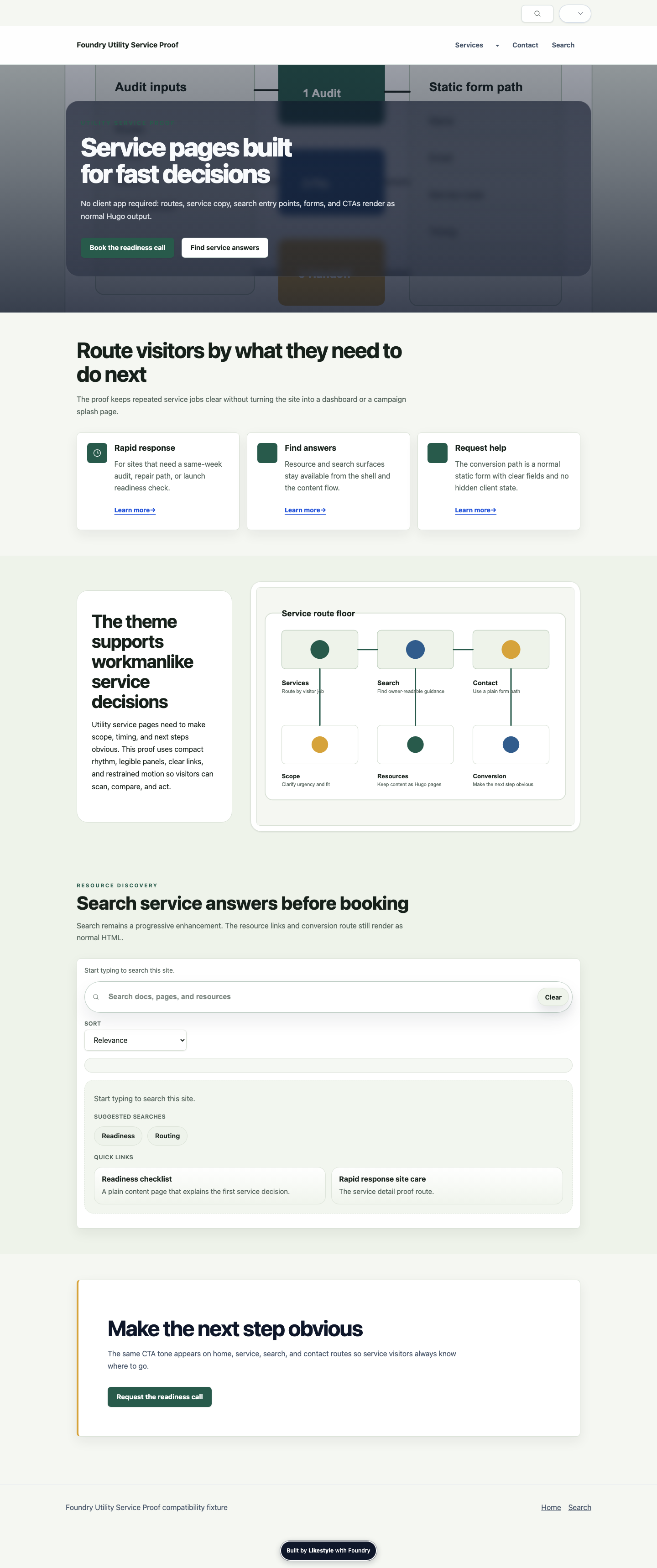
structured-clarity · draft
Structured Clarity
Create efficient, trustworthy, highly scannable experiences without forcing every service or information site into the same visual template.
Signature, best fit, and limits
Visual signature
- compact label hierarchy
- low-noise grouped panels
- visible search and CTA rail
- direct proof sequence
Best for
- service and information sites
- clear conversion paths
- resource discovery
- forms and practical navigation
Avoid when
- media atmosphere is the primary experience
- long-form narrative pacing is the primary differentiator
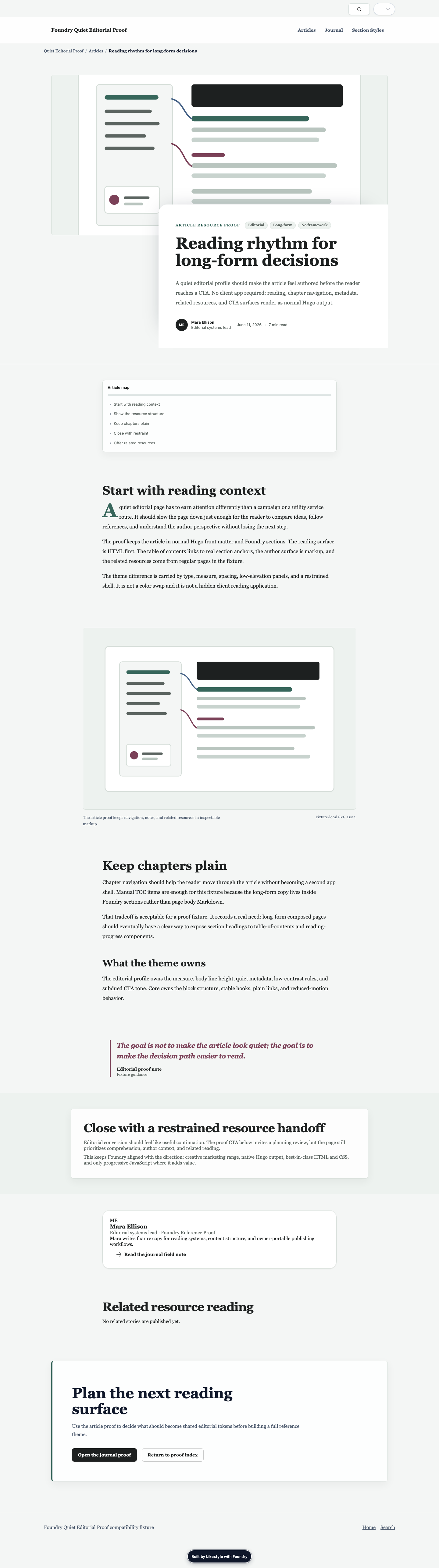
editorial-narrative · draft
Editorial Narrative
Create authored reading and story experiences whose hierarchy, pacing, and proof feel deliberate while content remains normal Hugo source.
Signature, best fit, and limits
Visual signature
- expressive reading hierarchy
- generous story pauses
- chapter-like evidence beats
- quiet orientation shell
Best for
- editorial and journal sites
- brand stories
- high-consideration narratives
- work and product stories
Avoid when
- the primary task is dense operational completion
- the content cannot support a meaningful narrative sequence
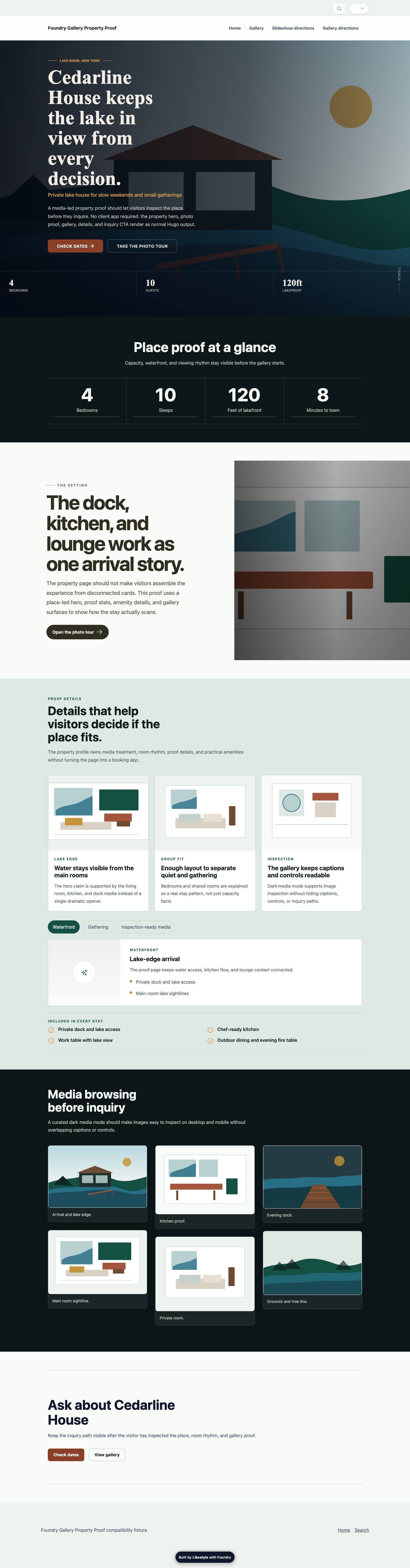
immersive-atmosphere · draft
Immersive Atmosphere
Create media-led campaign, destination, property, collection, and experience sites with distinctive atmosphere and bounded responsive behavior.
Signature, best fit, and limits
Visual signature
- media-led first viewport
- curated dark media surface
- expansive exploration rhythm
- clear inquiry handoff
Best for
- destinations and properties
- campaigns with strong media
- galleries and collections
- cinematic product or venue stories
Avoid when
- media quality is weak
- quick lookup and dense forms are the dominant jobs
- essential content would depend on client-side presentation
Reference Brand Systems
Teaching examples only. These fictional systems demonstrate the identity dimensions a real customer Brand System should own.
reference-clear-service
Reference Clear Service
Demonstrate a practical, trustworthy identity without embedding a real customer's facts or making green service styling a Theme Family.
Identity dimensions
- Heading type
- Inter, ui-sans-serif, system-ui, sans-serif
- Density
- compact
- Shape
- practical
reference-literary-studio
Reference Literary Studio
Demonstrate an authored editorial identity whose customer typography and color values remain independent from narrative layout grammar.
Identity dimensions
- Heading type
- Georgia, 'Times New Roman', ui-serif, serif
- Density
- comfortable
- Shape
- restrained
reference-natural-destination
Reference Natural Destination
Demonstrate a place-led identity with accurate media, natural color roles, and clear inquiry behavior independent from gallery composition grammar.
Identity dimensions
- Heading type
- Inter, ui-sans-serif, system-ui, sans-serif
- Density
- spacious
- Shape
- soft-architectural
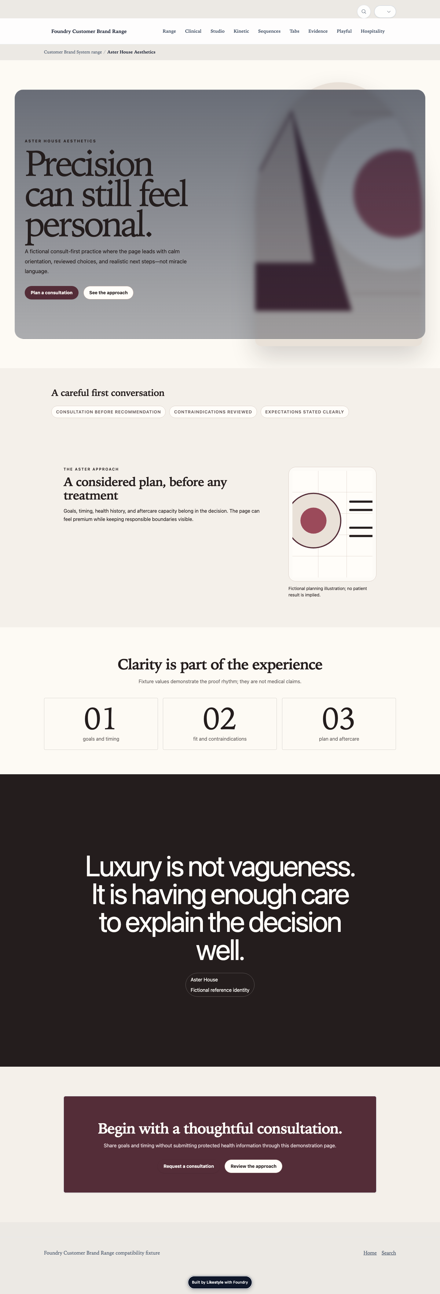
reference-clinical-luxury
Reference Clinical Luxury
Demonstrate a consult-first premium identity whose restraint, proof language, and media policy remain separate from real providers, patients, and medical claims.
Identity dimensions
- Heading type
- Iowan Old Style, Palatino Linotype, Georgia, serif
- Density
- spacious
- Shape
- mineral-tailored
reference-experimental-studio
Reference Experimental Studio
Demonstrate an expressive studio identity with hard geometry, confrontational contrast, and a repeatable system rather than a custom renderer fork.
Identity dimensions
- Heading type
- Impact, Haettenschweiler, Arial Narrow Bold, sans-serif
- Density
- comfortable
- Shape
- hard-offset
reference-playful-consumer
Reference Playful Consumer
Demonstrate an energetic consumer identity with friendly choice architecture, bold but accessible color roles, and maintainable responsive sections.
Identity dimensions
- Heading type
- Arial Rounded MT Bold, Trebuchet MS, ui-sans-serif, sans-serif
- Density
- compact
- Shape
- rounded-buoyant
reference-refined-hospitality
Reference Refined Hospitality
Demonstrate a restrained place-led identity whose material detail, media accuracy, and quiet inquiry language remain independent from property composition grammar.
Identity dimensions
- Heading type
- Baskerville, Iowan Old Style, Georgia, serif
- Density
- spacious
- Shape
- restrained-material
Editable beginnings
Page Types, Page Flows, and Page Starters
A Page Type defines responsibility. A Page Flow coordinates the sequence. A Page Starter is the editable content kit—this is the narrow, useful meaning of “starter.”
24 Page Types
Home Pagehome
Primary marketing home page for a site or locale.
Service Pageservice
Detailed marketing page for a treatment, service, or offering.
Services Indexservices-index
Index page for local service offerings.
Location Pagelocation
Local service page with coverage, contact, and trust signals.
Locations Indexlocations-index
Index page for service areas and local coverage.
Contact Pagecontact
Primary contact page for phone, email, address, hours, and forms.
FAQ Indexfaq-index
Frequently asked questions page with FAQ schema support.
Standard Pagestandard
General-purpose marketing page with moderate structure and broad section flexibility.
Story Pagestory
Marketing narrative page for product, service, venue, aesthetics, property, object, or destination stories.
Artist Profileartist-profile
Artist or photographer about page with profile context, selected work, and commission/contact cues.
Creative Archivecreative-archive
Works or archive page for portfolio projects, stills, motion, and selected series.
Creative Work Detailcreative-work-detail
Individual project or series storytelling page with chapter navigation, mixed media, notes, and an inquiry path.
Creative Journal Entrycreative-journal-entry
Individual journal, process note, essay, or studio dispatch page for creative portfolio sites.
Creative Journalcreative-journal
Journal or editorial index for process notes, essays, and studio dispatches.
Creative Exhibitionscreative-exhibitions
Exhibitions, screenings, talks, launches, or events index for creative portfolio sites.
Creative Contactcreative-contact
Contact, commission, inquiry, or collaboration page for creative portfolio sites.
Articlearticle
Markdown-first long-form resource or journal article rendered by the shared blog/single shell, with optional editorial inserts and light downstream overrides.
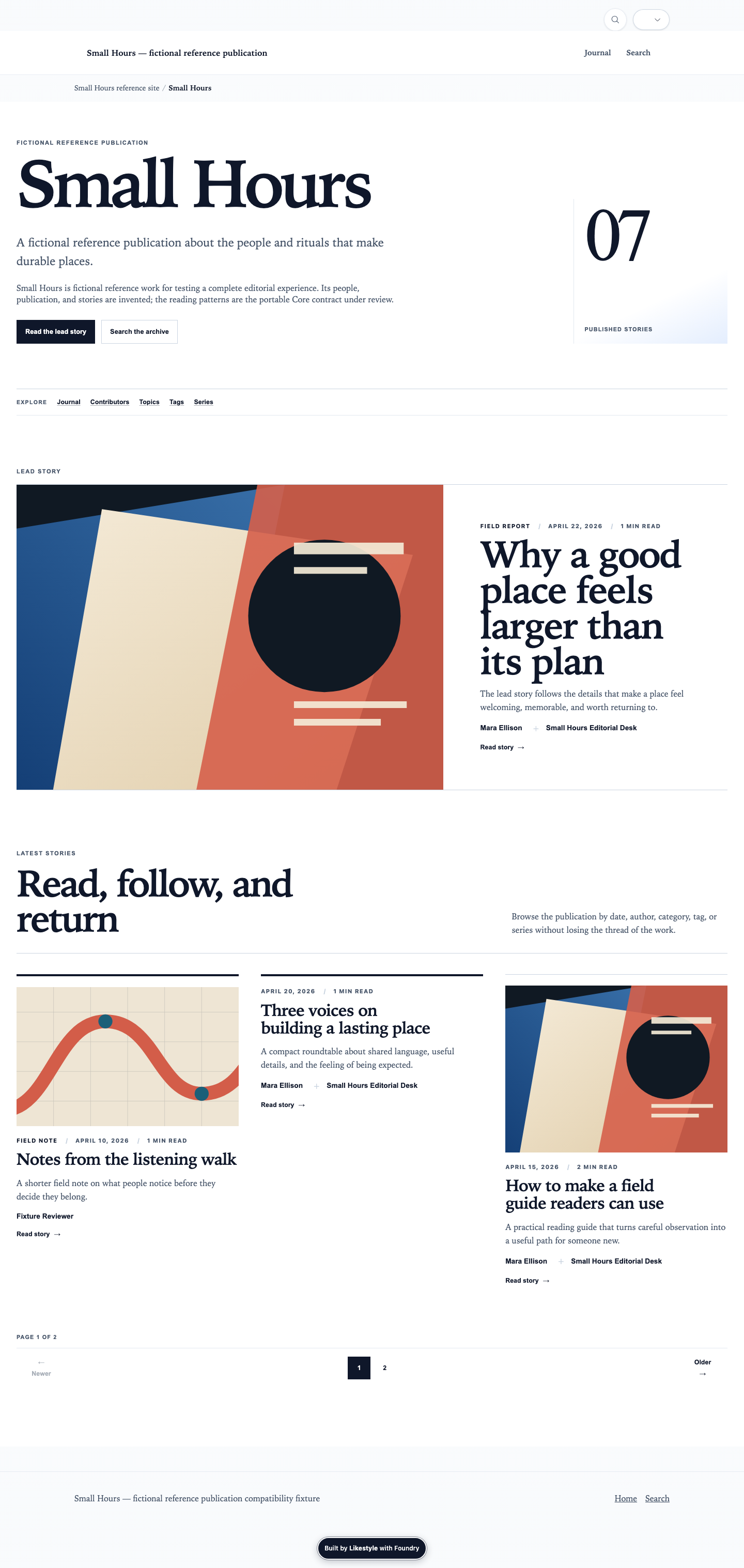
Author Pageauthor
Portable contributor archive with approved profile context and a paginated list resolved from canonical contributor keys.
Property Homeproperty-home
Cinematic home page for a luxury single-property retreat site — Ken Burns hero, stats-band overlap, dual narrative, gallery, and dual CTA.
Property Retreatproperty-retreat
Property walkthrough page — interior spaces, amenities, and atmosphere for a luxury rental retreat.
Property Adventuresproperty-adventures
Area activities and nearby attractions for a luxury retreat — organized by season or category.
Property Galleryproperty-gallery
Photo gallery page for a luxury rental retreat — organized property photography.
Property Bookproperty-book
Availability and booking page — calendar embed plus inquiry form for a luxury rental retreat.
23 Page Flows
Marketing Homemarketing-home
Flexible home-page narrative with hero, trust, differentiation, and conversion.
5 governed slots coordinate the page sequence.
Trust Funneltrust-funnel
Narrative flow optimized around proof, clarity, and a final action.
4 governed slots coordinate the page sequence.
Lead Capturelead-capture
Conversion-led landing structure with benefits, proof, and form.
5 governed slots coordinate the page sequence.
Campaign Evidence Flowcampaign-evidence-flow
Evidence-led campaign landing flow with media opener, editorial orientation, results proof, decision support, and restrained conversion.
5 governed slots coordinate the page sequence.
Product Story Flowproduct-story-flow
Media-led marketing story flow for product, service, venue, aesthetics, property, object, and destination narratives.
7 governed slots coordinate the page sequence.
Comparison Journeycomparison-journey
Page flow for evaluating options, pricing, and tradeoffs.
4 governed slots coordinate the page sequence.
Service Detailservice-detail
Structured service page with overview, outcomes, and close.
5 governed slots coordinate the page sequence.
Location Detaillocation-detail
Local landing flow with geographic coverage and contact intent.
5 governed slots coordinate the page sequence.
Creative Homecreative-home
Portfolio-led home flow with selected work, artist context, and a clear commission/contact path.
4 governed slots coordinate the page sequence.
Creative Profilecreative-profile
Artist/about flow with profile, process, selected work, and commission framing.
4 governed slots coordinate the page sequence.
Creative Archivecreative-archive
Works/archive flow with framing, selected projects, and a clear path back to contact or commissioning.
4 governed slots coordinate the page sequence.
Creative Work Detailcreative-work-detail
Project storytelling flow with chapter navigation, mixed-media sequence, process notes, and inquiry close.
5 governed slots coordinate the page sequence.
Creative Journalcreative-journal
Editorial index flow for journal posts, process notes, and studio dispatches.
3 governed slots coordinate the page sequence.
Creative Journal Entrycreative-journal-entry
Editorial story flow for process notes, essays, field notes, and studio dispatches.
3 governed slots coordinate the page sequence.
Creative Exhibitionscreative-exhibitions
Events flow for exhibitions, screenings, talks, launches, and appearances.
3 governed slots coordinate the page sequence.
Creative Contactcreative-contact
Inquiry flow for commissions, collaborations, licensing, or studio contact.
3 governed slots coordinate the page sequence.
Article Longformarticle-longform
Long-form editorial structure with lighter inserts and closing modules.
4 governed slots coordinate the page sequence.
Concierge Property Homeconcierge-property-home
Cinematic 7-section home flow: Ken Burns hero → stats-band overlap → retreat story → adventure features → gallery → seasonal narrative → dual CTA. Designed for seamless flow, not stacked boxes.
7 governed slots coordinate the page sequence.
Property Retreatproperty-retreat
Property walkthrough: hero → stats → amenity grid → gallery → CTA.
5 governed slots coordinate the page sequence.
Property Adventuresproperty-adventures
Area activities page: hero → contrast intro → seasonal/category features → CTA.
4 governed slots coordinate the page sequence.
Property Galleryproperty-gallery
Photo gallery page: hero → masonry gallery → CTA.
3 governed slots coordinate the page sequence.
Property Bookproperty-book
Availability and booking page: header → calendar embed → inquiry form → CTA.
4 governed slots coordinate the page sequence.
Author Archiveauthor-archive
Contributor archive flow with optional portable profile context before the automatically resolved story collection.
1 governed slots coordinate the page sequence.
26 Page Starters
Home Foundationhome-foundation
Starter home-page draft with hero, proof, story, and conversion sections.
Page Type: home · Flow: marketing-home
Services Index Starterservices-index-starter
Local service services index with intro, service grid, proof, and conversion close.
Page Type: services-index · Flow: trust-funnel
Locations Index Starterlocations-index-starter
Local service coverage index with map coverage, service-area copy, and conversion close.
Page Type: locations-index · Flow: location-detail
Contact Startercontact-starter
Primary contact page with contact split and trust badges.
Page Type: contact · Flow: trust-funnel
FAQ Index Starterfaq-index-starter
Frequently asked questions page with structured FAQ sections and CTA close.
Page Type: faq-index · Flow: trust-funnel
Landing Lead Capturelanding-lead-capture
Conversion-led landing page draft with offer framing, benefits, proof, and form close.
Page Type: landing · Flow: lead-capture
Campaign Evidence Landingcampaign-evidence-landing
Evidence-led campaign landing page with media orientation, results proof, comparison, FAQ, and restrained consultation close.
Page Type: landing · Flow: campaign-evidence-flow
Product Story Starterproduct-story-starter
Media-led story page starter for products, services, venues, aesthetics, property, objects, and destinations.
Page Type: story · Flow: product-story-flow
Service Detail Starterservice-detail-starter
Structured service page draft with overview, outcomes, proof, and close.
Page Type: service · Flow: service-detail
Location Presence Starterlocation-presence-starter
Localized page draft with coverage, trust, and contact intent.
Page Type: location · Flow: location-detail
Standard Story Starterstandard-story-starter
General-purpose page draft for about, process, or overview pages.
Page Type: standard · Flow: trust-funnel
Creative Home Portfoliocreative-home-portfolio
Portfolio-led home page draft with selected work, artist context, and a commission CTA.
Page Type: home · Flow: creative-home
Artist Profile Starterartist-profile-starter
Artist/about page draft with profile details, process notes, and a commission CTA.
Page Type: artist-profile · Flow: creative-profile
Creative Archive Startercreative-archive-starter
Works/archive page draft with selected projects and a clear contact path.
Page Type: creative-archive · Flow: creative-archive
Creative Work Detail Startercreative-work-detail-starter
Individual work or series page draft with chapter navigation, mixed-media storytelling, notes, and an inquiry CTA.
Page Type: creative-work-detail · Flow: creative-work-detail
Creative Journal Index Startercreative-journal-index-starter
Journal index draft for process notes, essays, and studio dispatches.
Page Type: creative-journal · Flow: creative-journal
Creative Journal Entry Startercreative-journal-entry-starter
Individual journal entry draft for process notes, essays, field notes, and studio dispatches.
Page Type: creative-journal-entry · Flow: creative-journal-entry
Creative Exhibitions Startercreative-exhibitions-starter
Exhibitions and events page draft with dated entries and a collaboration CTA.
Page Type: creative-exhibitions · Flow: creative-exhibitions
Creative Contact Startercreative-contact-starter
Contact and commission page draft for studio inquiries and collaboration requests.
Page Type: contact · Flow: creative-contact
Article Resource Starterarticle-resource-starter
Long-form article draft with a structured intro, body outline, and closing CTA.
Page Type: article · Flow: article-longform
Property Home Cinematicproperty-home-cinematic
Cinematic 7-section home flow for a luxury single-property retreat site. Ken Burns hero cycling real photos, floating stats-band, dual retreat+adventure narrative, gallery, and dual CTA.
Page Type: home · Flow: concierge-property-home
Property Retreat Starterproperty-retreat-starter
Starter retreat page for a luxury rental — interior walk-through, amenities, and space descriptions.
Page Type: property-retreat · Flow: property-retreat
Property Adventures Starterproperty-adventures-starter
Starter adventures page — nearby attractions organized by season and category with contrast positioning angle.
Page Type: property-adventures · Flow: property-adventures
Property Gallery Starterproperty-gallery-starter
Starter gallery page — guided room-by-room property photo tour.
Page Type: property-gallery · Flow: property-gallery
Property Book Starterproperty-book-starter
Starter booking page — availability calendar embed plus inquiry form.
Page Type: property-book · Flow: property-book
Author Page Starterauthor-page-starter
Starter contributor archive backed by a canonical data/authors record and the shared editorial collection.
Page Type: author · Flow: author-archive
Compose by visitor job
Section Families, Section Types, and Styles
Choose what a Section must accomplish before choosing a renderer or presentation. Styles change presentation without changing the content responsibility.
hero · stable
Hero
Page-entry orientation and primary first impression.
Visitor job: Orient the visitor, establish the page promise, and present the primary action.
proof · stable
Proof
Trust, evidence, reassurance, and credibility.
Visitor job: Help the visitor believe the claim through proof, attribution, outcomes, or authority signals.
gallery · stable
Gallery
Browsing, comparing, and moving through related media items.
Visitor job: Let the visitor browse a media collection without making every image carry a narrative or proof job.
media · stable
Media
Section-level storytelling with one or a few media moments.
Visitor job: Use media to pace explanation, editorial rhythm, chapter structure, or immersive story moments.
presence · stable
Social & Presence
Recent work, channel signals, public activity, and platform proof rendered without requiring provider API access.
Visitor job: Help visitors see current activity or social proof from normalized static items while preserving the site-owned Hugo contract.
discovery · stable
Discovery
Search, filtering, topical entry, and metadata-led browsing.
Visitor job: Help visitors find the right page, topic, audience path, or content set without making a generic card grid do search work.
collections · stable
Collections
Known lists of pages, posts, related items, or collection members.
Visitor job: Render a selected content set cleanly when the visitor needs to scan a known list rather than search across metadata.
editorial · stable
Editorial
Long-form prose, commentary, emphasis, quotes, and authored narrative sections.
Visitor job: Give text-heavy content structure, rhythm, and emphasis without forcing prose into feature cards.
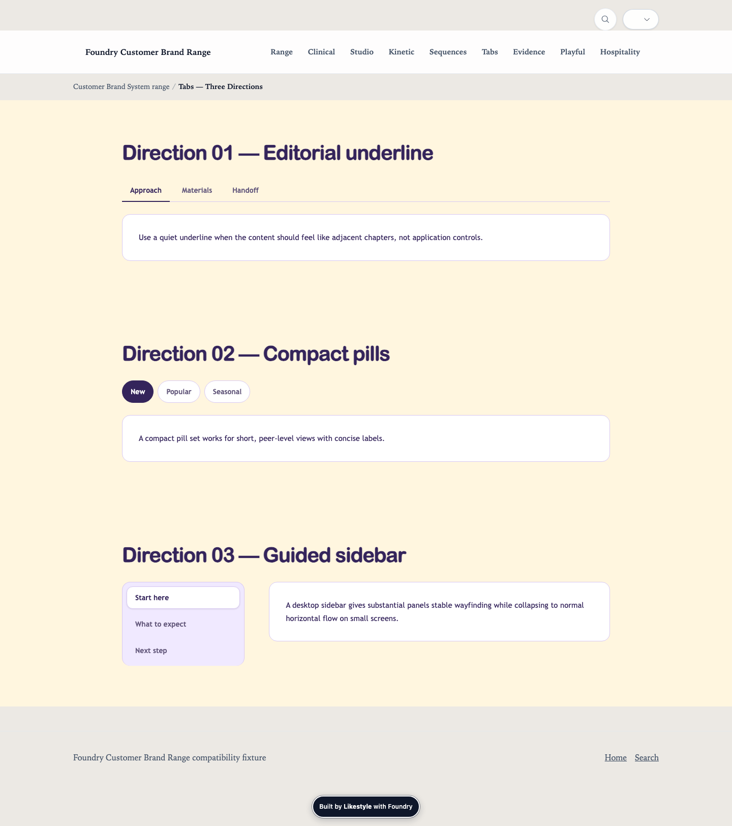
navigation · stable
Navigation & Disclosure
In-page wayfinding, controlled disclosure, and structured long-page navigation.
Visitor job: Help visitors move through complex content without turning every detail into a separate page.
features · stable
Features & Highlights
Benefits, capabilities, highlights, and quick-scan value points.
Visitor job: Let visitors understand what is offered or why it matters through concise, scannable highlights.
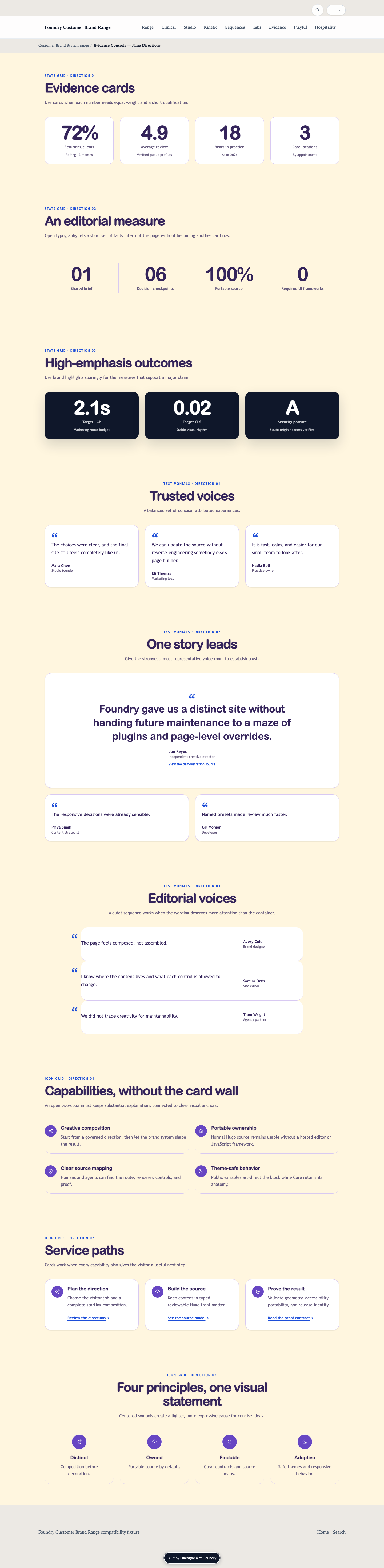
process · stable
Process & Data
Steps, timelines, stats, maps, metrics, and sequential explanation.
Visitor job: Explain how something works, what happened over time, what the numbers show, or where something applies.
conversion · stable
Conversion & Calls To Action
Prompts, offers, lead magnets, newsletter capture, and next-step action surfaces.
Visitor job: Move the visitor toward a clear next action after enough context, proof, or value has been established.
forms · stable
Forms & Contact
Inquiry, contact, and portable form intent surfaces.
Visitor job: Collect structured visitor intent or contact details while keeping form behavior framework-owned.
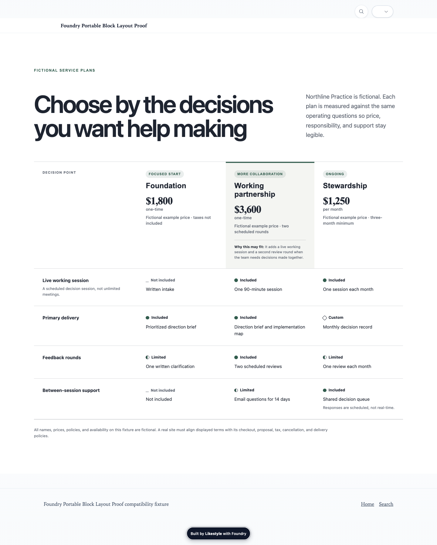
pricing · stable
Pricing & Comparison
Pricing tiers, side-by-side comparison, packages, and decision support.
Visitor job: Help visitors compare offers, understand tradeoffs, and choose a package or option.
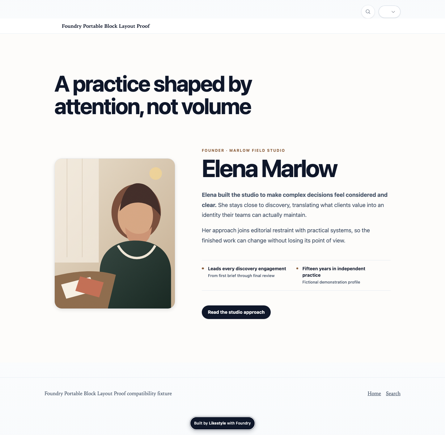
people · stable
People & Profiles
Founders, artists, teams, authors, and identity-led trust surfaces.
Visitor job: Present the people behind the work with enough context to support trust, authorship, or relationship.
property · stable
Property & Hospitality
Property, retreat, amenity, place, and hospitality-specific storytelling.
Visitor job: Show a property or hospitality offer through place, amenities, tour media, and booking context.
layout · stable
Layout & Flow
Structural rhythm, section grouping, columns, dividers, and full-bleed composition changes.
Visitor job: Change page rhythm or arrangement without pretending structural layout is content.
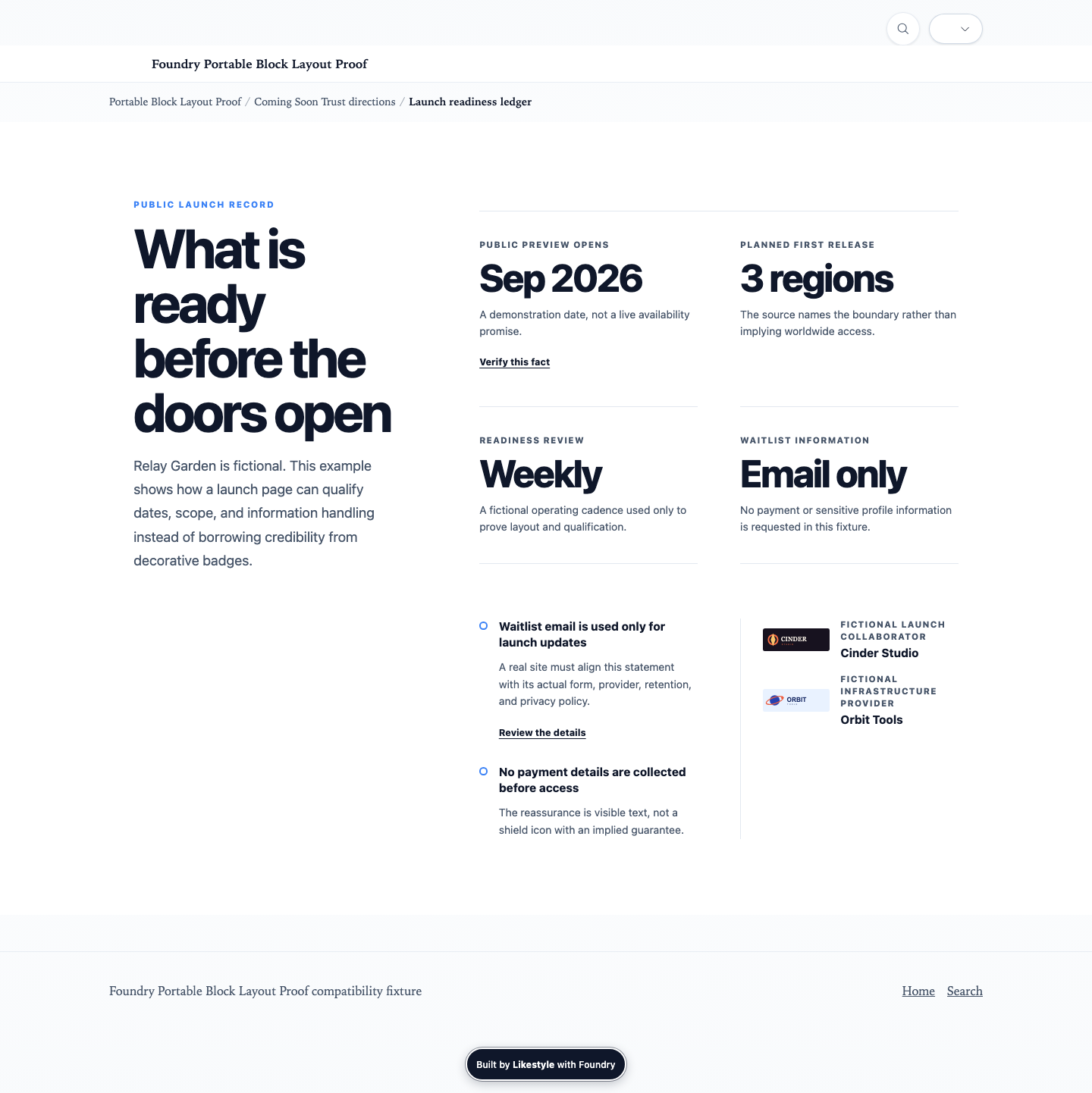
launch · stable
Launch & Coming Soon
Temporary, pre-release, waitlist, and launch-state page sections.
Visitor job: Publish a deliberate temporary launch experience without creating throwaway site-local framework code.
55 Section Types
Accordionaccordion
Reveal supporting detail without leaving the page.
Renderer: accordion · Family: navigation
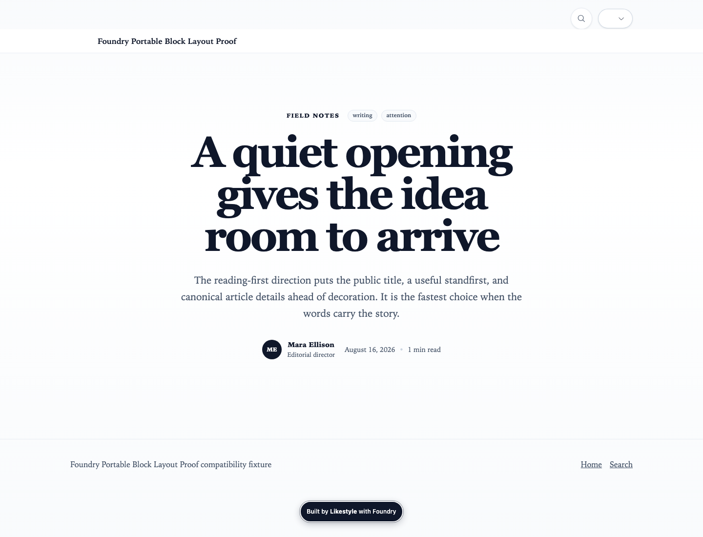
Article Introductionarticle-hero
Open an article with authored metadata and media.
Renderer: post-hero · Family: hero
Audioaudio
Present an accessible authored audio item.
Renderer: audio-player · Family: media
Author Profileauthor-profile
Attribute authored content to a person or organization.
Renderer: author-bio · Family: people
Before and Afterbefore-after
Compare two related images with an accessible disclosure model.
Renderer: before-after · Family: gallery
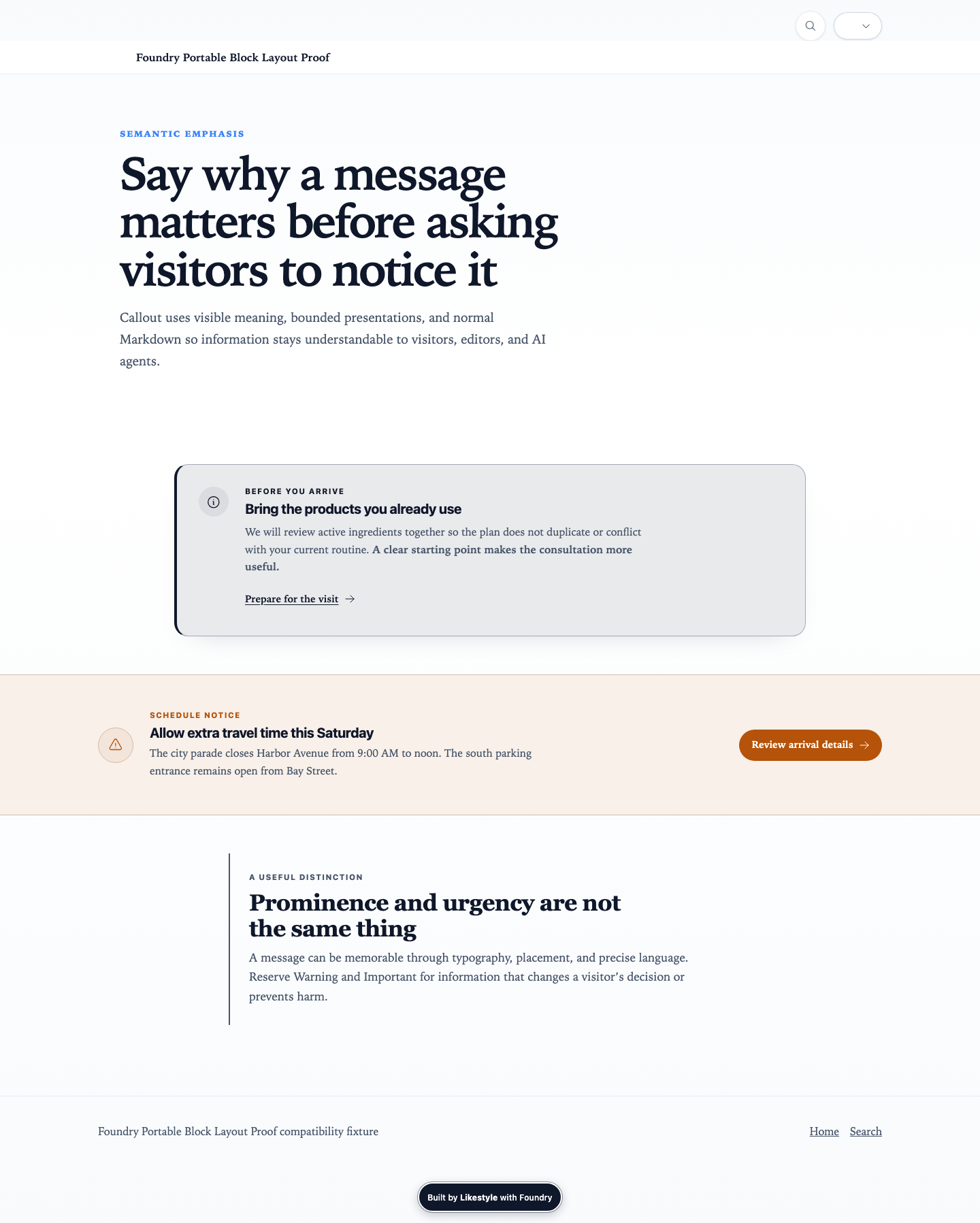
Calloutcallout
Emphasize an important editorial note or warning.
Renderer: callout · Family: editorial
Case Studiescase-studies
Present outcome-based evidence with appropriate context.
Renderer: case-studies · Family: proof
Comparisoncomparison
Compare options and tradeoffs in a structured form.
Renderer: comparison-table · Family: pricing
Contactcontact
Pair direct contact guidance with a clear next action.
Renderer: contact-split · Family: forms
Guided Contact Formcontact-form-panel
Keep direct contact guidance beside a managed form.
Renderer: managed-form-panel · Family: forms
Content Feedcontent-feed
Show a query-driven set of current site content.
Renderer: content-feed · Family: discovery
Content Navigationcontent-navigation
Navigate a deep content area with persistent local context.
Renderer: content-sidebar-nav · Family: navigation
Coverage Mapcoverage-map
Explain where a service, property, or program applies.
Renderer: map-coverage · Family: process
Call to Actioncta
Move the visitor toward one clear next step.
Renderer: cta · Family: conversion
Embedembed
Place a declared external or portable embedded resource.
Renderer: embed · Family: media
Frequently Asked Questionsfaq
Answer recurring questions with semantic disclosure.
Renderer: faq-accordion · Family: navigation
Features and Highlightsfeatures
Explain an offer through concise, scannable highlights.
Renderer: features · Family: features
Gallerygallery
Let visitors browse a media collection.
Renderer: gallery · Family: gallery
Guided Discoveryguided-discovery
Guide visitors through a bounded decision path.
Renderer: guided-discovery · Family: discovery
Herohero
Orient the visitor and establish the page promise.
Renderer: hero · Family: hero
Image Breakimage-break
Create an intentional visual beat in a longer page.
Renderer: media-break · Family: media
Launch Introductionlaunch-hero
Open a temporary launch or waitlist experience.
Renderer: coming-soon-hero · Family: launch
Resource Offerlead-magnet
Offer a downloadable resource in exchange for declared intent.
Renderer: lead-magnet · Family: conversion
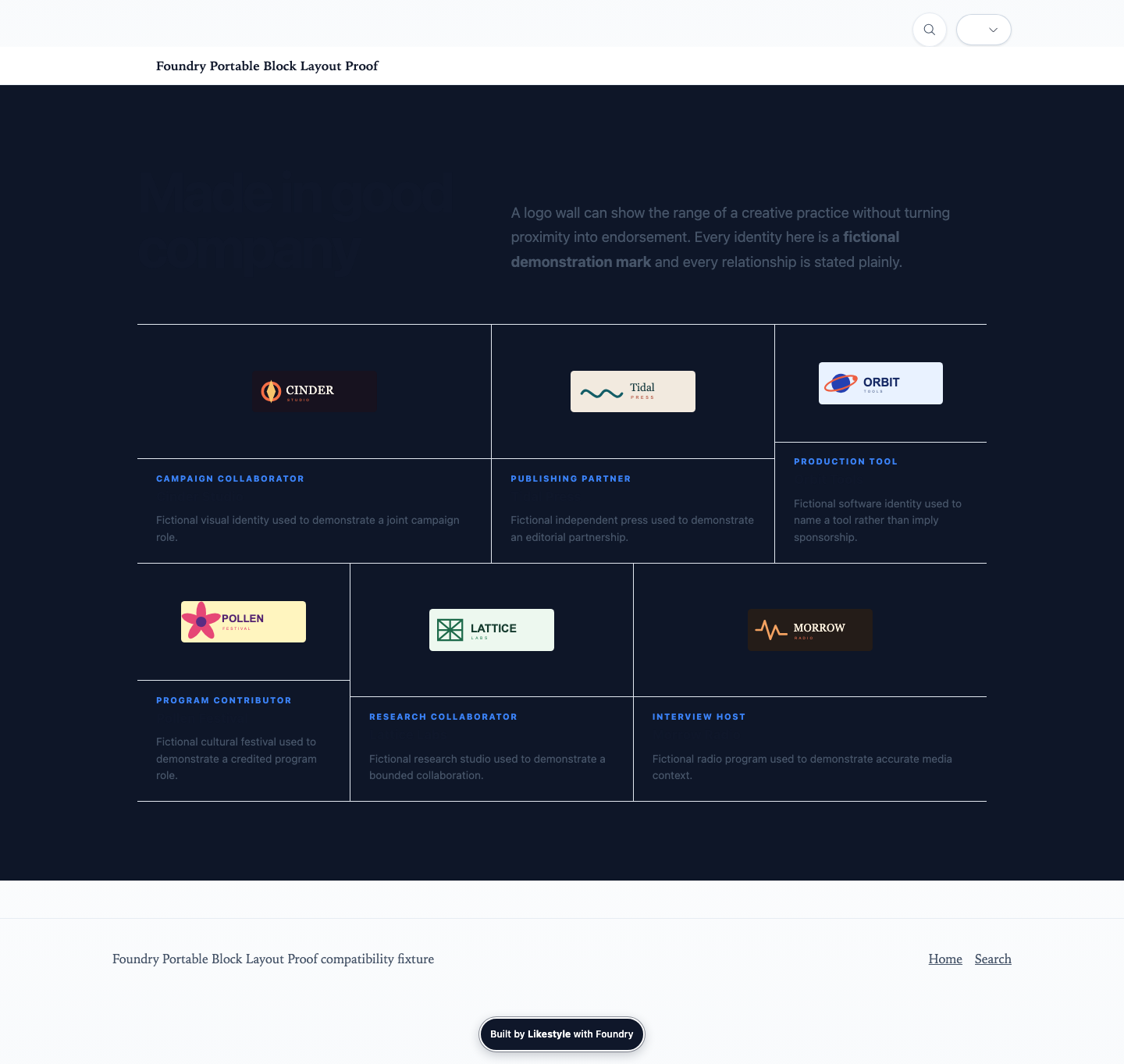
Logo Cloudlogo-cloud
Show an accurately named collection of organizations, publications, tools, sponsors, collaborators, or brands with plain relationship context.
Renderer: logos · Family: proof
Managed Formmanaged-form
Collect structured intent with a useful fail-closed fallback.
Renderer: managed-form · Family: forms
Media Sequencemedia-sequence
Tell a paced story across an ordered media sequence.
Renderer: media-sequence · Family: media
Media and Storymedia-story
Explain an idea by pairing narrative and media.
Renderer: media-text · Family: media
Newsletter Signupnewsletter
Invite a visitor into an ongoing publication relationship.
Renderer: newsletter-inline · Family: conversion
Page Listpage-list
Present a known set of site pages for browsing.
Renderer: page-list · Family: collections
Peoplepeople-grid
Present a group of people with consistent context.
Renderer: team-grid · Family: people
Pinned Media Storypinned-story
Pair pinned media with a progressing narrative.
Renderer: pinned-media-story · Family: media

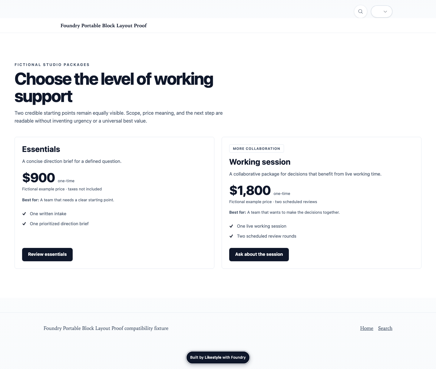
Pricingpricing
Present packages or offers with understandable differences.
Renderer: pricing-tiers · Family: pricing
Processprocess
Explain a sequence of actions or expectations.
Renderer: steps · Family: process
Profileprofile
Introduce one important person with narrative context.
Renderer: founder-profile · Family: people
Property Introductionproperty-hero
Open a property or hospitality page with place-specific context.
Renderer: property-hero · Family: hero
Property Tourproperty-tour
Present an ordered, place-aware property media tour.
Renderer: property-photo-tour · Family: gallery
Quotequote
Give an attributed statement editorial emphasis.
Renderer: quote · Family: editorial
Related Contentrelated-content
Offer contextually related editorial content.
Renderer: related-posts · Family: collections
Relationship Maprelationship-map
Explain connected entities or concepts.
Renderer: relationship-map · Family: discovery
Resourcesresources
Present useful files or references for download.
Renderer: resource-downloads · Family: features
Route Chooserroute-chooser
Help visitors choose the most relevant path.
Renderer: discovery-cards · Family: discovery
Audience Routingrouting-panels
Offer distinct next actions for multiple visitor intents.
Renderer: routing-panels · Family: conversion
Searchsearch
Search indexed site content.
Renderer: search · Family: discovery
Section Headingsection-heading
Orient a visitor at the start of a major page chapter.
Renderer: section-header · Family: hero
Share Toolsshare-tools
Offer deliberate sharing actions for published content.
Renderer: social-share · Family: presence
Social Activitysocial-feed
Show normalized site-owned social activity previews.
Renderer: social-preview-grid · Family: presence
Statisticsstats
Support a claim with concise quantitative evidence.
Renderer: stats-band · Family: proof
Table of Contentstable-of-contents
Navigate headings within a substantial page.
Renderer: table-of-contents · Family: navigation
Tabstabs
Switch between closely related content panels without changing routes.
Renderer: tabs · Family: navigation
Testimonialstestimonials
Present attributed customer or participant evidence.
Renderer: testimonials · Family: proof
Texttext
Present substantial portable narrative content.
Renderer: rich-text · Family: editorial
Timelinetimeline
Explain events or milestones over time.
Renderer: timeline · Family: process
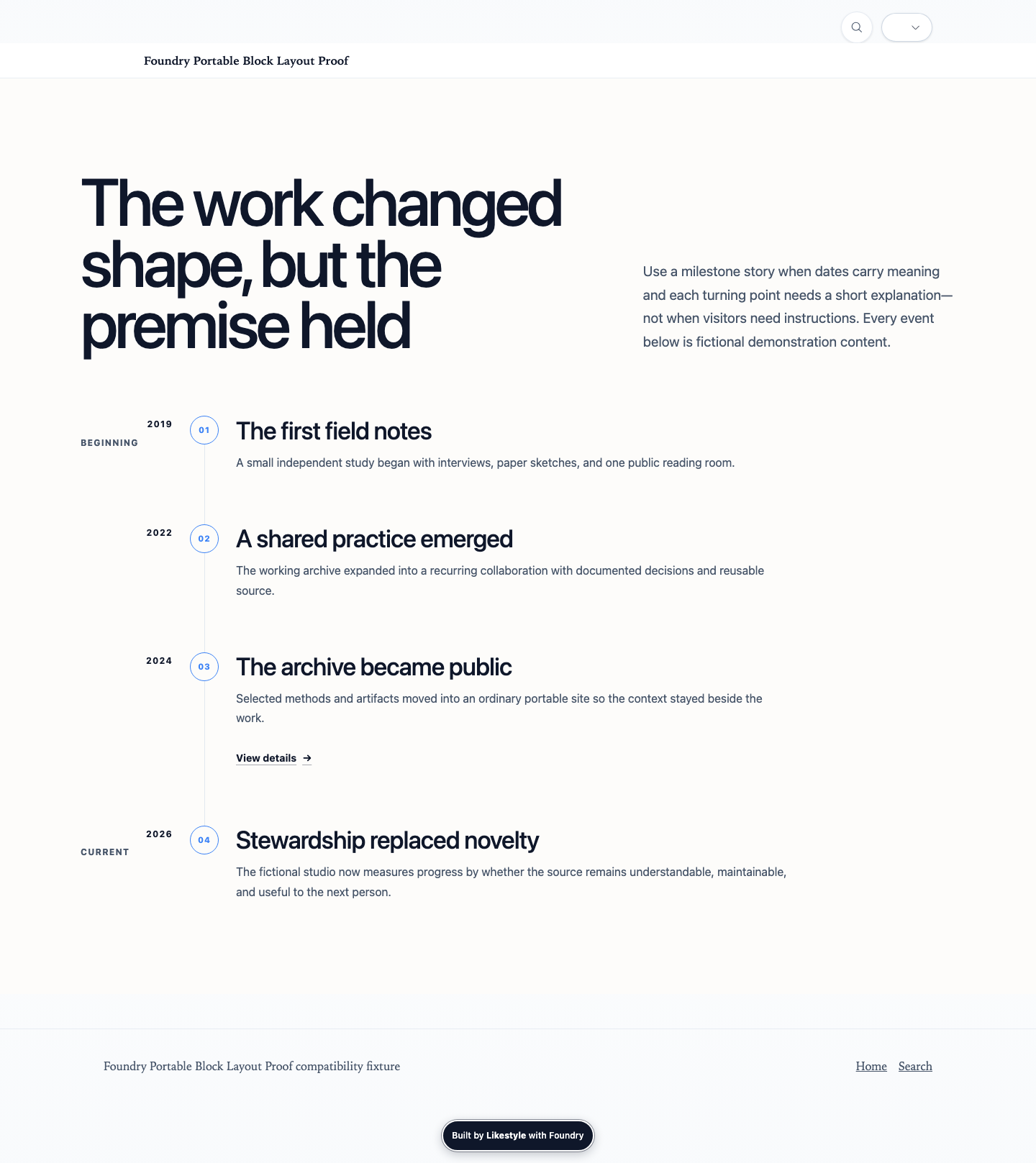
Trust Markstrust-marks
Present compact reassurance, certifications, or trust signals.
Renderer: trust-badges · Family: proof
Videovideo
Present an authored video with accessible fallback context.
Renderer: video-embed · Family: media
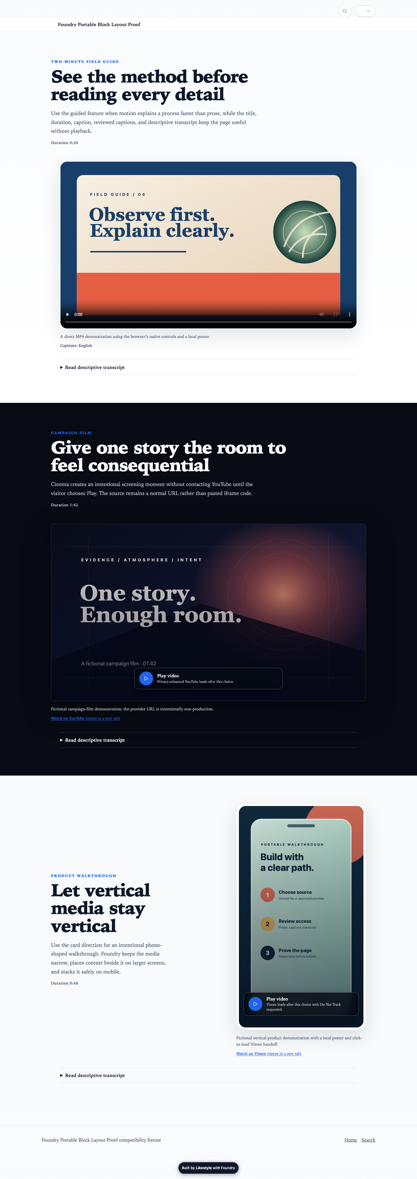
Video Introductionvideo-hero
Open a page with a responsibly loaded video treatment.
Renderer: video-hero · Family: hero
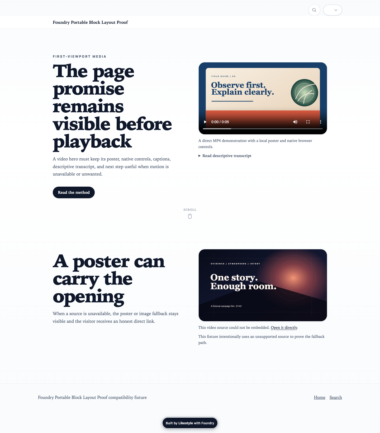
24 Section Styles
Certificationstrust-marks.certifications
Present credentials as compact authority evidence.
Renderer: certification-badges · Controls: density, mark-treatment
Launchcta.launch
Give a temporary launch action restrained emphasis.
Renderer: coming-soon-cta · Controls: alignment, emphasis
Launch Reassurancetrust-marks.launch
State what is ready, what is promised, and which named relationships support a temporary launch.
Renderer: coming-soon-trust · Controls: evidence-emphasis, density, relationship-prominence
Action Listcta.action-list
Offer several bounded next actions without changing the CTA job.
Renderer: cta-button-list · Controls: alignment, action-hierarchy
Media CTActa.media
Pair a conversion handoff with relevant authored media.
Renderer: cta-image-paragraph · Controls: media-position, media-treatment, alignment
FAQ Follow-upcta.faq-follow-up
Resolve the final one to three decision questions and hand visitors to one accurate next step without repeating the complete FAQ.
Renderer: faq-cta · Controls: decision-close-composition, answer-visibility, handoff-emphasis, action-hierarchy
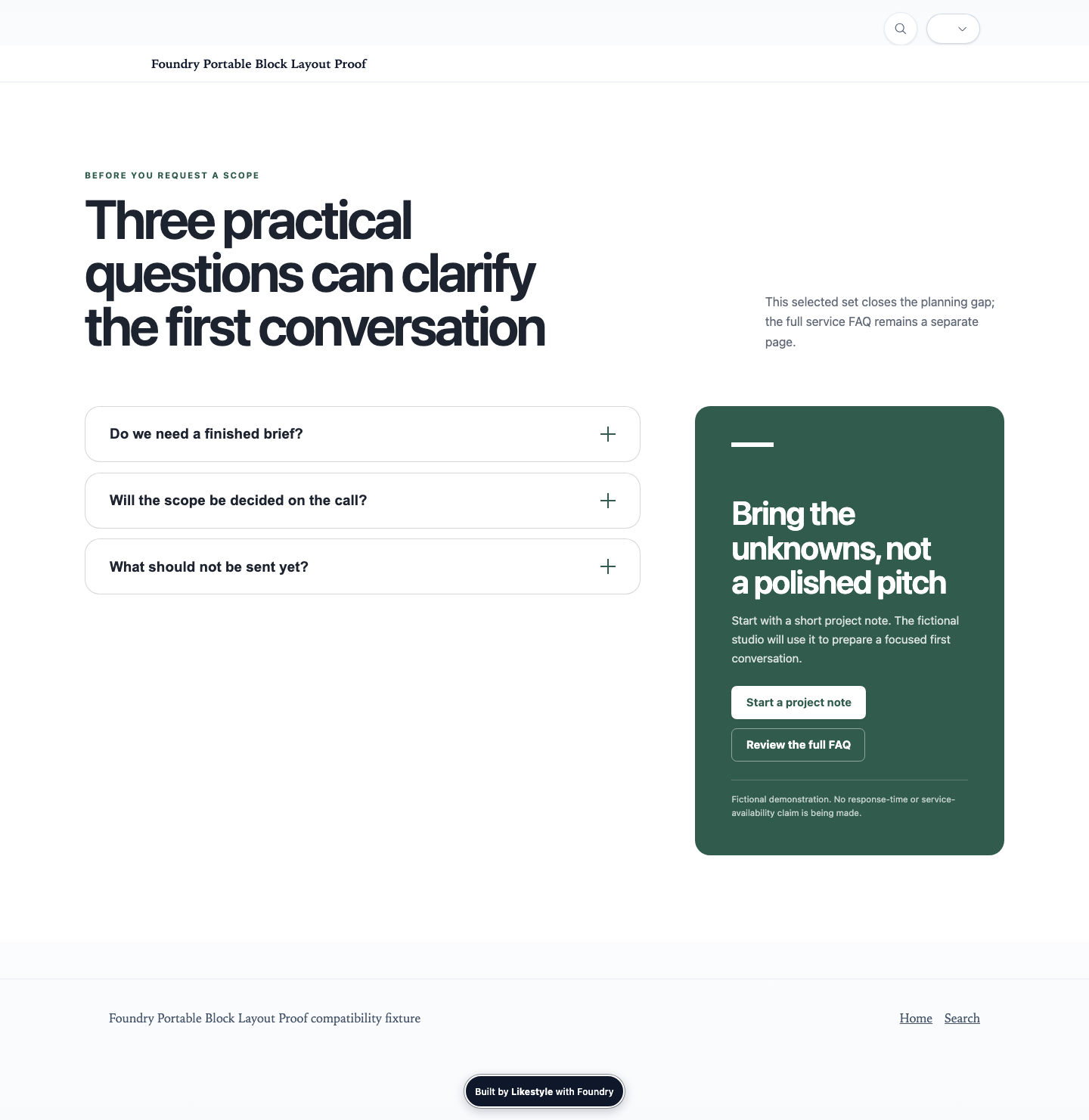
Full Bleedmedia-story.full-bleed
Give an authored media story edge-to-edge visual rhythm.
Renderer: full-bleed-split · Controls: media-position, minimum-height, motion
Icon Highlightsfeatures.icons
Scan benefits through concise icon-led highlights.
Renderer: icon-grid · Controls: columns, panel-treatment
Illustrationmedia-story.illustration
Explain a story beat with an authored illustration.
Renderer: illustration-panel · Controls: media-position, frame, density
Image Featuremedia-story.image-feature
Give one image deliberate editorial emphasis.
Renderer: image-feature · Controls: containment, shape, lightbox
Logo Striptrust-marks.logo-strip
Present compact recognizable affiliation or customer proof.
Renderer: logo-trust · Controls: density, mark-treatment
Masonrygallery.masonry
Create varied editorial gallery rhythm while retaining logical order.
Renderer: masonry-gallery · Controls: columns, gap, lightbox
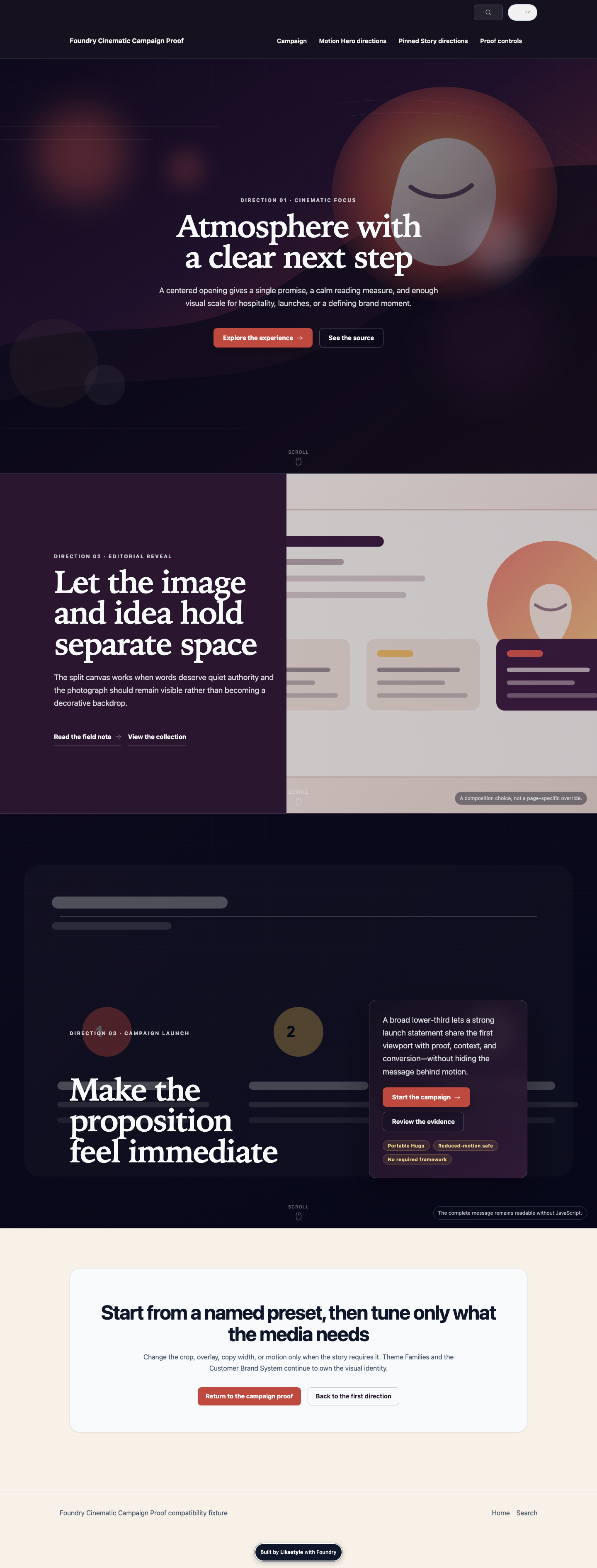
Cinematichero.cinematic
Create a media-led first impression with bounded motion.
Renderer: motion-hero · Controls: content-position, overlay, motion, minimum-height
Onboardingtimeline.onboarding
Explain a bounded onboarding sequence.
Renderer: onboarding-timeline · Controls: marker-treatment, density
Editorial Listpage-list.editorial
Present an authored reading list with editorial hierarchy.
Renderer: post-list · Controls: view, metadata, media
Pricing Comparisoncomparison.pricing
Help visitors choose among priced plans using shared decision criteria and visible qualifications.
Renderer: pricing-comparison · Controls: comparison-composition, plan-emphasis, state-labels, price-qualification
Amenitiesfeatures.amenities
Organize place-specific amenities as scannable features.
Renderer: property-amenities · Controls: category-navigation, media-treatment
Property Cardspage-list.property
Present properties or destinations as a browsable collection.
Renderer: property-cards · Controls: columns, media-treatment, metadata
Prose Paneltext.panel
Set off a bounded prose passage without changing its semantic job.
Renderer: prose-panel · Controls: surface, measure, spacing
Pull Quotequote.pullquote
Emphasize a short attributable excerpt in editorial flow.
Renderer: pullquote · Controls: alignment, emphasis
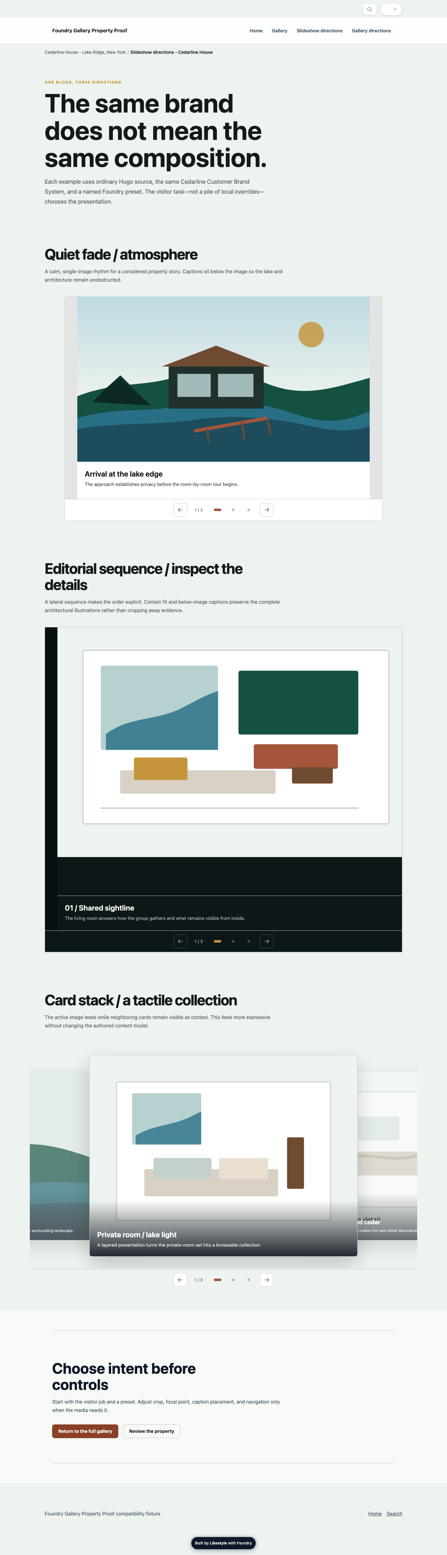
Slideshowgallery.slideshow
Present a focused sequential media experience.
Renderer: slideshow · Controls: navigation, timing, media-fit
Stats Gridstats.grid
Show several measurable facts as a scannable grid.
Renderer: stats-grid · Controls: columns, emphasis
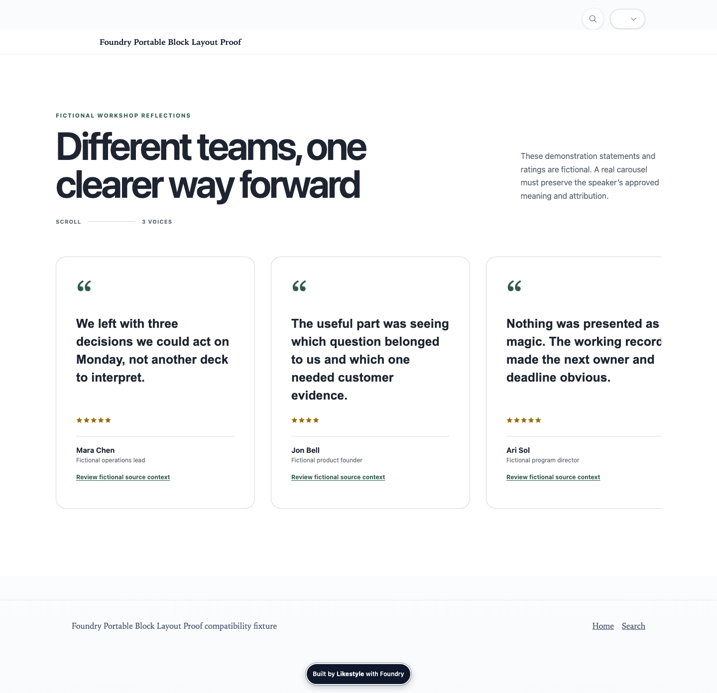
Testimonial Carouseltestimonials.carousel
Sequence several approved attributed voices when a static testimonial grid would be too dense.
Renderer: testimonials-carousel · Controls: composition, evidence-density, lead-emphasis, rating-visibility, quotation-mark-visibility
Topic Chipsroute-chooser.topic-chips
Offer compact topic-led route choices.
Renderer: topic-chip-nav · Controls: density, wrapping, selection-emphasis
Portable renderers
All 82 Blocks
Blocks are Hugo renderers with declared content and design contracts. Filter the full Core inventory; every card keeps its image coverage explicit.
heroes-intros · stable
Hero
hero
Contract summary
1 required fields · 2 declared variants · 10 design fields
heroes-intros · stable
Post Hero
post-hero
Contract summary
1 required fields · 3 declared variants · 5 design fields
heroes-intros · stable
Section Header
section-header
Contract summary
1 required fields · 0 declared variants · 4 design fields
search-discovery · stable
Search
search
Contract summary
0 required fields · 2 declared variants · 15 design fields
search-discovery · stable
Guided Discovery
guided-discovery
Contract summary
1 required fields · 2 declared variants · 2 design fields
search-discovery · stable
Discovery Cards
discovery-cards
Contract summary
1 required fields · 2 declared variants · 3 design fields
search-discovery · stable
Relationship Map
relationship-map
Contract summary
1 required fields · 2 declared variants · 2 design fields
layout-flow · stable
Divider
divider
Contract summary
0 required fields · 4 declared variants · 3 design fields
layout-flow · stable
Columns
columns
Contract summary
1 required fields · 3 declared variants · 6 design fields
conversion-cta · stable
Newsletter Inline
newsletter-inline
Contract summary
0 required fields · 3 declared variants · 2 design fields
forms-contact · stable
Managed Form
managed-form
Contract summary
1 required fields · 3 declared variants · 2 design fields
forms-contact · stable
Managed Form Panel
managed-form-panel
Contract summary
1 required fields · 1 declared variants · 2 design fields
trust-authority · stable
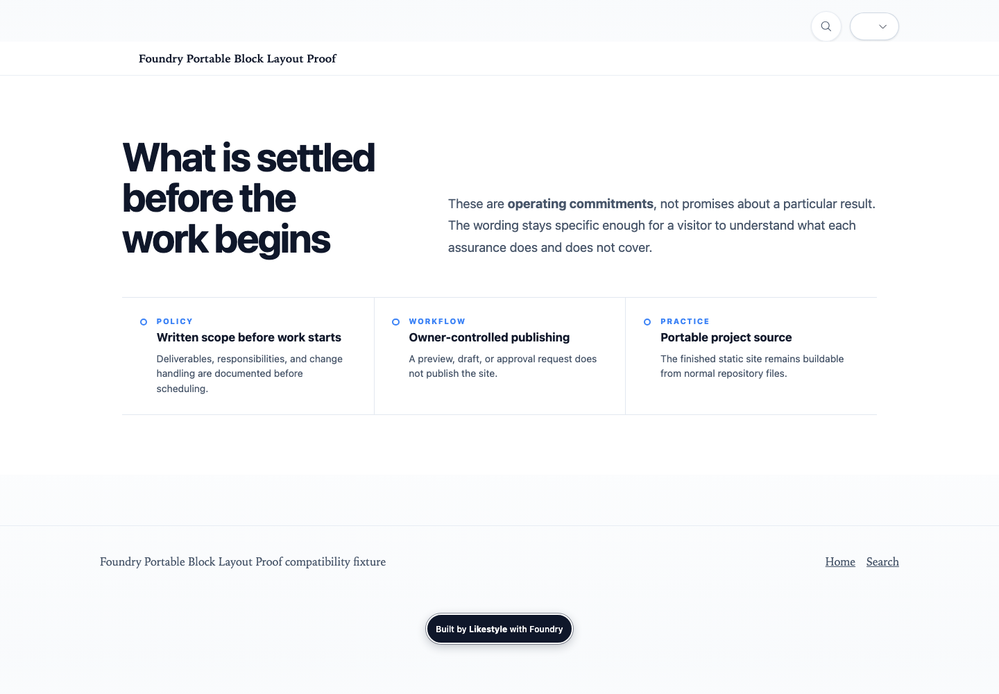
Trust Badges
trust-badges
Contract summary
1 required fields · 3 declared variants · 2 design fields
features-highlights · stable
Features
features
Contract summary
1 required fields · 3 declared variants · 3 design fields
media-gallery · stable
Media Text
media-text
Contract summary
3 required fields · 3 declared variants · 12 design fields
media-gallery · stable
Media Break
media-break
Contract summary
2 required fields · 3 declared variants · 10 design fields
media-gallery · stable
Media Sequence
media-sequence
Contract summary
1 required fields · 5 declared variants · 9 design fields
media-gallery · stable
Pinned Media Story
pinned-media-story
Contract summary
1 required fields · 3 declared variants · 21 design fields
media-gallery · stable
Slideshow
slideshow
Contract summary
1 required fields · 3 declared variants · 11 design fields
media-gallery · stable
Image Feature
image-feature
Contract summary
2 required fields · 5 declared variants · 8 design fields
media-gallery · stable
Masonry Gallery
masonry-gallery
Contract summary
0 required fields · 0 declared variants · 4 design fields
lists-collections · stable
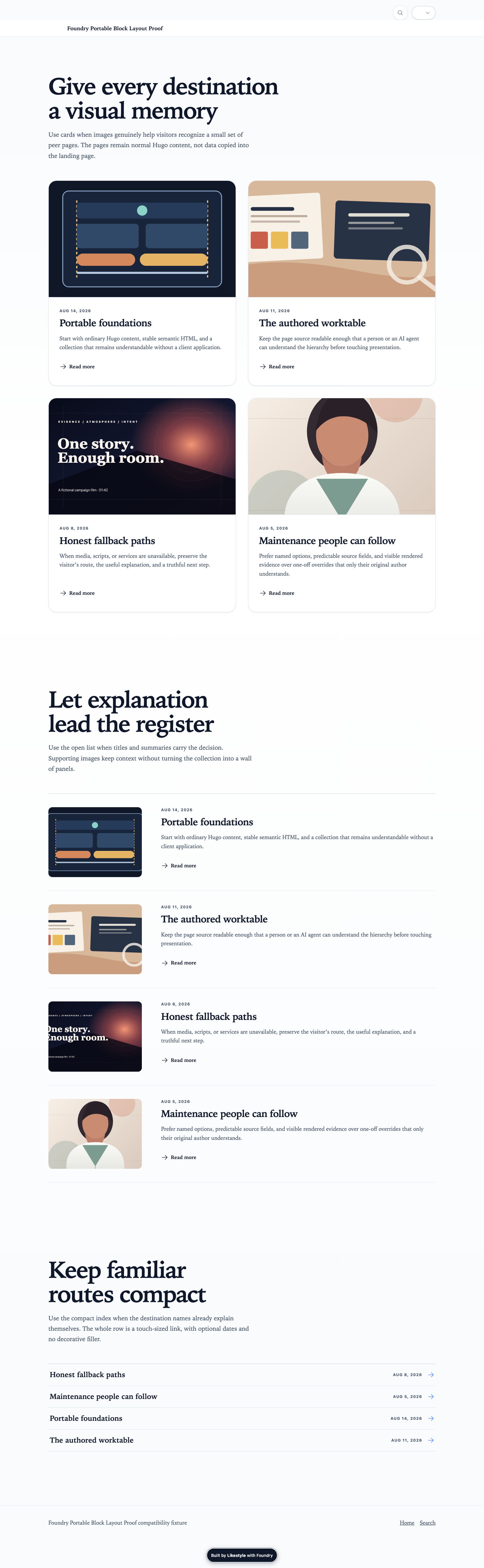
Page List
page-list
Contract summary
1 required fields · 3 declared variants · 6 design fields
lists-collections · stable
Post List
post-list
Contract summary
1 required fields · 3 declared variants · 7 design fields
search-discovery · stable
Content Feed
content-feed
Contract summary
0 required fields · 4 declared variants · 9 design fields
narrative-editorial · stable
Quote
quote
Contract summary
1 required fields · 3 declared variants · 2 design fields
narrative-editorial · stable
Pullquote
pullquote
Contract summary
1 required fields · 4 declared variants · 3 design fields
narrative-editorial · stable
Rich Text
rich-text
Contract summary
1 required fields · 4 declared variants · 3 design fields
narrative-editorial · stable
Callout
callout
Contract summary
1 required fields · 3 declared variants · 4 design fields
people-profiles · stable
Author Bio
author-bio
Contract summary
2 required fields · 3 declared variants · 2 design fields
lists-collections · stable
Related Posts
related-posts
Contract summary
0 required fields · 3 declared variants · 2 design fields
navigation-disclosure · stable
Table Of Contents
table-of-contents
Contract summary
0 required fields · 4 declared variants · 7 design fields
navigation-disclosure · stable
Tabs
tabs
Contract summary
1 required fields · 3 declared variants · 3 design fields
media-gallery · stable
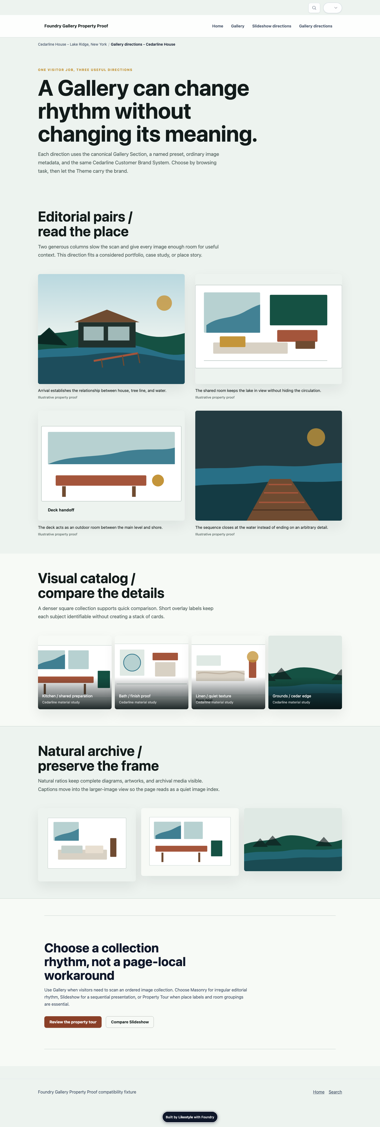
Gallery
gallery
Contract summary
1 required fields · 0 declared variants · 6 design fields
navigation-disclosure · stable
Accordion
accordion
Contract summary
1 required fields · 3 declared variants · 3 design fields
social-presence · stable
Social Preview Grid
social-preview-grid
Contract summary
0 required fields · 3 declared variants · 11 design fields
trust-authority · stable
Social Share
social-share
Contract summary
1 required fields · 3 declared variants · 2 design fields
media-gallery · stable
Video Embed
video-embed
Contract summary
2 required fields · 3 declared variants · 5 design fields
media-gallery · stable
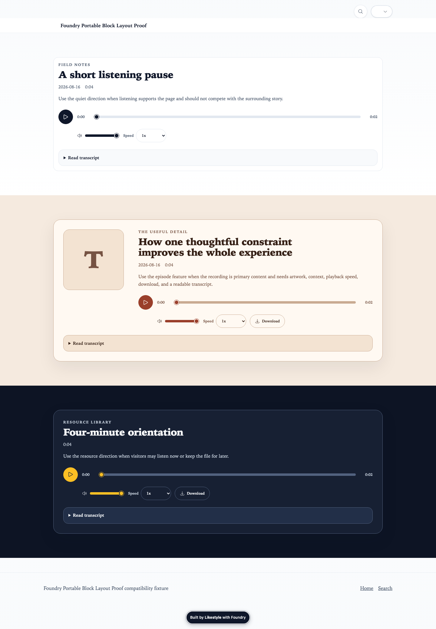
Audio Player
audio-player
Contract summary
2 required fields · 3 declared variants · 2 design fields
media-gallery · stable
Embed
embed
Contract summary
1 required fields · 3 declared variants · 8 design fields
features-highlights · stable
Icon Grid
icon-grid
Contract summary
1 required fields · 3 declared variants · 3 design fields
process-data · stable
Steps
steps
Contract summary
1 required fields · 3 declared variants · 6 design fields

process-data · stable
Stats Band
stats-band
Contract summary
1 required fields · 3 declared variants · 3 design fields
heroes-intros · stable
Video Hero
video-hero
Contract summary
2 required fields · 0 declared variants · 11 design fields
media-gallery · stable
Before After
before-after
Contract summary
2 required fields · 3 declared variants · 4 design fields
navigation-disclosure · stable
Content Sidebar Nav
content-sidebar-nav
Contract summary
1 required fields · 4 declared variants · 7 design fields
process-data · stable
Timeline
timeline
Contract summary
1 required fields · 3 declared variants · 2 design fields
process-data · stable
Map Coverage
map-coverage
Contract summary
1 required fields · 3 declared variants · 6 design fields
forms-contact · stable
Contact Split
contact-split
Contract summary
0 required fields · 3 declared variants · 2 design fields
conversion-cta · stable
CTA
cta
Contract summary
1 required fields · 2 declared variants · 2 design fields
trust-authority · stable
Testimonials
testimonials
Contract summary
1 required fields · 3 declared variants · 2 design fields
trust-authority · stable
Testimonials Carousel
testimonials-carousel
Contract summary
1 required fields · 3 declared variants · 4 design fields
trust-authority · stable
Logos
logos
Contract summary
1 required fields · 3 declared variants · 6 design fields
process-data · stable
Onboarding Timeline
onboarding-timeline
Contract summary
1 required fields · 3 declared variants · 2 design fields
process-data · stable
Stats Grid
stats-grid
Contract summary
1 required fields · 3 declared variants · 3 design fields
navigation-disclosure · stable
FAQ Accordion
faq-accordion
Contract summary
1 required fields · 3 declared variants · 2 design fields
conversion-cta · stable
FAQ CTA
faq-cta
Contract summary
3 required fields · 3 declared variants · 2 design fields
narrative-editorial · stable
Prose Panel
prose-panel
Contract summary
1 required fields · 0 declared variants · 1 design fields
media-gallery · stable
Illustration Panel
illustration-panel
Contract summary
1 required fields · 0 declared variants · 1 design fields
trust-authority · stable
Case Studies
case-studies
Contract summary
1 required fields · 3 declared variants · 2 design fields
trust-authority · stable
Certification Badges
certification-badges
Contract summary
1 required fields · 0 declared variants · 1 design fields
features-highlights · stable
Resource Downloads
resource-downloads
Contract summary
1 required fields · 0 declared variants · 1 design fields
conversion-cta · stable
Lead Magnet
lead-magnet
Contract summary
0 required fields · 0 declared variants · 1 design fields
search-discovery · stable
Topic Chip Nav
topic-chip-nav
Contract summary
1 required fields · 0 declared variants · 3 design fields
people-profiles · stable
Team Grid
team-grid
Contract summary
1 required fields · 3 declared variants · 2 design fields
people-profiles · stable
Founder Profile
founder-profile
Contract summary
1 required fields · 3 declared variants · 2 design fields
conversion-cta · stable
CTA Image Paragraph
cta-image-paragraph
Contract summary
1 required fields · 3 declared variants · 4 design fields
pricing-comparison · stable
Comparison Table
comparison-table
Contract summary
1 required fields · 3 declared variants · 2 design fields
conversion-cta · stable
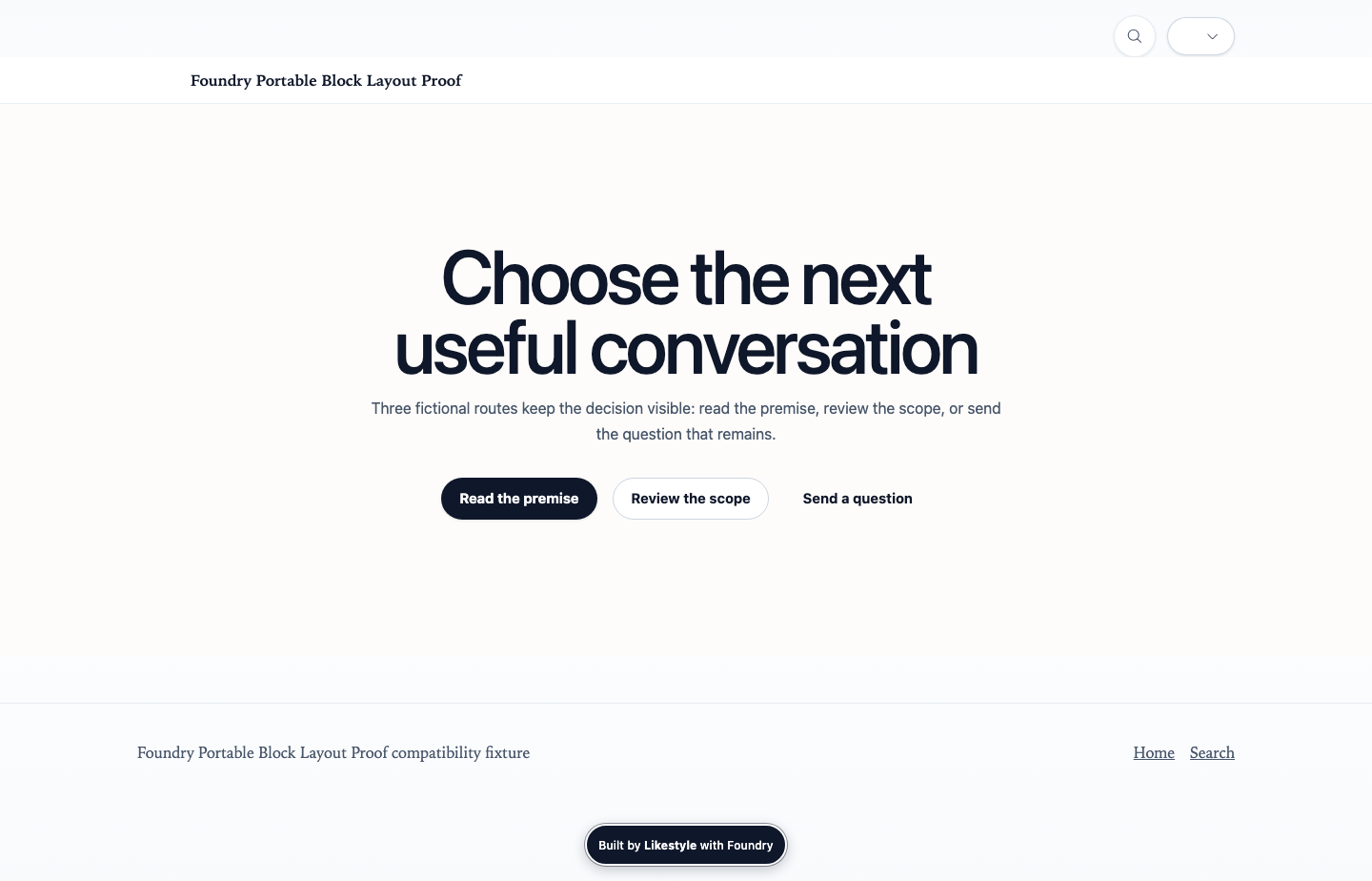
CTA Button List
cta-button-list
Contract summary
1 required fields · 3 declared variants · 3 design fields
conversion-cta · stable
Routing Panels
routing-panels
Contract summary
1 required fields · 1 declared variants · 2 design fields
pricing-comparison · stable
Pricing Tiers
pricing-tiers
Contract summary
1 required fields · 3 declared variants · 2 design fields
pricing-comparison · stable
Pricing Comparison
pricing-comparison
Contract summary
1 required fields · 3 declared variants · 2 design fields
features-highlights · stable
Logo Trust
logo-trust
Contract summary
2 required fields · 3 declared variants · 2 design fields
heroes-intros · stable
Coming Soon Hero
coming-soon-hero
Contract summary
1 required fields · 0 declared variants · 1 design fields
launch-coming-soon · stable
Coming Soon CTA
coming-soon-cta
Contract summary
1 required fields · 0 declared variants · 1 design fields
launch-coming-soon · stable
Coming Soon Trust
coming-soon-trust
Contract summary
0 required fields · 3 declared variants · 2 design fields
launch-coming-soon · stable
Coming Soon Footer
coming-soon-footer
Contract summary
0 required fields · 0 declared variants · 1 design fields
heroes-intros · stable
Motion Hero
motion-hero
Contract summary
1 required fields · 3 declared variants · 30 design fields
property-hospitality · stable
Property Hero
property-hero
Contract summary
1 required fields · 0 declared variants · 14 design fields
property-hospitality · stable
Property Amenities
property-amenities
Contract summary
1 required fields · 1 declared variants · 3 design fields
property-hospitality · stable
Property Photo Tour
property-photo-tour
Contract summary
1 required fields · 1 declared variants · 3 design fields
property-hospitality · stable
Property Cards
property-cards
Contract summary
0 required fields · 2 declared variants · 4 design fields
layout-flow · stable
Full Bleed Split
full-bleed-split
Contract summary
2 required fields · 0 declared variants · 11 design fields
What people actually edit
All 414 declared controls
Controls are projected from Core’s Block editor schemas. Most are shown inside their owning Block evidence; dedicated control-by-control captures remain a documented coverage opportunity.
Herohero7 controls
Content · text
Headline
content.titleState the page promise in clear language a visitor can understand at a glance.
Content · text
Short context label
content.eyebrowUse a short category or context label only when it helps the headline make sense.
Content · markdown
Supporting text
content.textAdd one concise explanation that supports the headline without repeating it.
Content · asset-picker
Hero image
content.imageChoose an image that strengthens the page promise and remains readable behind the text.
Content · action-editor
Primary action
content.primary_actionChoose the single most important next step for this page.
Content · action-editor
Secondary action
content.secondary_actionOffer a lower-commitment alternative only when visitors genuinely need one.
Design · select
Layout
design.variantKeep the recommended centered layout for short positioning. Choose left-aligned when the copy needs a stronger reading edge.
Post Heropost-hero5 controls
Content · text
Article title
content.titleUse the exact public article title. Keep author, publication date, reading time, categories, and tags in the article metadata rather than rewriting them here.
Content · markdown
Article introduction
content.textWrite a concise standfirst in portable Markdown that explains why the article matters without repeating its title.
Content · asset-picker
Featured image
content.imageChoose one meaningful article image. Additional rotating media and motion timing remain advanced source options.
Content · text
Image description
content.image_altDescribe the image's useful meaning for people who cannot see it. Leave it empty only when the image is purely decorative.
Design · select
Article opening layout
design.variantUse Centered for most articles, Split when one portrait-oriented image should share the opening, or Stacked for a wide image before the title.
Section Headersection-header7 controls
Content · text
Section heading
content.titleName the next part of the page clearly so visitors can scan the page and understand the change in subject.
Content · text
Short context label
content.eyebrowAdd a brief category or orientation label only when it makes the heading easier to understand.
Content · markdown
Introduction
content.textUse concise portable Markdown to introduce the section without repeating the heading or the content that follows.
Content · action-editor
Optional action
content.ctaAdd one action only when visitors need a direct route from this heading; use a Call to Action Section for a stronger ask.
Design · select
Heading role
design.title_tagKeep Section heading for normal in-page use. Choose Page heading only when this is the page's single primary heading and no Hero already supplies it.
Design · select
Alignment
design.alignUse Center for a distinct transition between page sections. Choose Left when the heading belongs to a left-aligned reading flow.
Design · select
Emphasis
design.sizeKeep Large for a clear section transition. Use a smaller or extra-large scale only when the surrounding page hierarchy calls for it.
Searchsearch6 controls
Content · text
Search heading
content.titleName what visitors can find when the purpose is not already clear from the page heading.
Content · markdown
Search explanation
content.textAdd one concise sentence about the pages, resources, or answers included in search.
Content · text
Input prompt
content.placeholderUse a short prompt that helps visitors understand what they can search for without putting instructions in their query.
Design · toggle
Show result images
design.show_imagesKeep images on when they help visitors recognize results. Turn them off for a more text-focused resource index.
Design · toggle
Show matching sub-pages
design.show_sub_resultsTurn this on only when matching headings or sub-pages help visitors reach the exact answer faster.
Design · select
Layout
design.variantUse Default for a full search destination or Minimal when search sits inside an already established page flow.
Discovery Cardsdiscovery-cards6 controls
Content · text
Short context label
content.eyebrowAdd a short orientation label only when it helps visitors understand the choice they are making.
Content · text
Route chooser heading
content.titleName the decision in visitor language so each route can answer it clearly.
Content · markdown
Route chooser introduction
content.textAdd concise portable Markdown when visitors need context before comparing the routes.
Content · repeater
Visitor routes
content.itemsAdd, remove, and reorder explicit routes. Existing Discovery Graph node selections remain supported when routes are governed centrally.
Design · select
Route presentation
design.variantUse Grid for most decisions or Compact when routes are concise and the surrounding page is dense.
Design · select
Columns
design.columnsUse three columns for most sets, two for longer explanations, or four only for very concise routes.
Columnscolumns7 controls
Content · text
Section heading
content.titleAdd a clear heading that defines the comparison set.
Content · repeater
Columns
content.columnsAdd, remove, and reorder columns. Use heading, optional value, and text for each entry.
Design · select
Display style
design.variantUse Prose for heading/text, Feature for icon-plus-heading, and Stat for value-led columns.
Design · select
Column count
design.countChoose how many columns should render on desktop.
Design · select
Gap
design.gapUse tighter spacing for dense content and larger spacing for long blocks.
Design · select
Cross-axis alignment
design.alignChoose alignment for row content.
Design · toggle
Show dividers
design.dividersAdd subtle dividing rules between columns on wider layouts.
Newsletter Inlinenewsletter-inline8 controls
Content · text
Section heading
content.titleUse a short heading that explains what visitors are subscribing for.
Content · markdown
Supporting text
content.textAdd concise context for the action and expected communication cadence.
Content · text
Input placeholder
content.placeholderKeep this placeholder practical and non-technical.
Content · text
Submit button text
content.button_textUse one clear action phrase.
Content · markdown
Privacy note
content.privacy_noteExplain what submitted contact data is used for and retention.
Content · url
Legacy form endpoint
content.form_actionUse only when managed forms are not available.
Content · managed-form-picker
Managed form
content.form.form_keySelect a configured managed form. Managed form behavior is controlled by Foundry Control.
Design · select
Layout
design.variantUse Card for compact emphasis, Banner for a larger split pattern, or Minimal for low-footprint use.
Managed Formmanaged-form5 controls
Content · text
Form heading
content.titleName the request or next step in clear visitor-facing language.
Content · markdown
Supporting text
content.textAdd a concise explanation of what the visitor should submit and what happens next.
Content · managed-form-picker
Approved form
content.form.form_keyChoose an already configured form. Its fields, destination, validation, consent policy, and submission workflow are managed outside this page.
Content · markdown
Privacy note
content.privacy_noteExplain how submitted information will be used or link to the applicable privacy details without making unsupported promises.
Design · select
Layout
design.variantUse Narrow for most forms, Wide when the approved form needs more horizontal room, or Panel for stronger visual separation.
Trust Badgestrust-badges4 controls
Content · text
Assurances heading
content.titleName what these credentials, memberships, standards, or assurances have in common when visitors need context.
Content · markdown
Proof context
content.introductionExplain the scope or limit of the displayed assurances in concise portable Markdown. Do not turn a policy, membership, or credential into a broader outcome claim.
Content · repeater
Assurances
content.itemsAdd only current, accurately named trust marks the organization is authorized to display, and order them by visitor relevance.
Design · select
Presentation
design.variantUse Chips for a compact assurance strip, Logos for an approved seal gallery, or List for a numbered proof ledger with context and sources.
Featuresfeatures6 controls
Content · text
Short context label
content.eyebrowAdd a short category or promise only when it helps visitors understand how these highlights fit the page.
Content · text
Highlights heading
content.titleName the shared benefit, capability, or idea that connects these parallel highlights.
Content · markdown
Highlights introduction
content.textAdd one concise Markdown introduction when visitors need context before scanning the individual highlights.
Content · repeater
Highlights
content.itemsAdd, remove, and reorder distinct highlights. Keep them parallel in meaning and similar in depth so the set remains easy to scan.
Design · select
Highlight style
design.variantUse Cards for most sets, Plain for a lighter reading flow, or Linked cards when the highlights are genuine navigation choices.
Design · select
Columns
design.columnsUse three columns for most concise sets. Choose two for longer explanations or four only for very short highlights.
Media Textmedia-text11 controls
Content · text
Story heading
content.titleName the idea or benefit this story beat should explain. Keep it specific and easy to scan.
Content · text
Short context label
content.eyebrowAdd a short category or sequence label only when it helps visitors understand where this story beat fits.
Content · markdown
Story
content.textWrite one focused explanation. Use simple Markdown for emphasis or links, and move long-form material to the page body.
Content · asset-picker
Story image
content.imageChoose an image that adds meaning rather than repeating the text, then describe its useful meaning in Image description.
Content · text
Image description
content.image_altDescribe the image's useful meaning for people who cannot see it. Leave it empty only when the image is purely decorative.
Content · text
Image caption
content.media_captionAdd a short caption only when the image needs context, attribution, or explanation.
Content · action-editor
Primary action
content.primary_actionOffer one clear next step when this story beat should lead visitors somewhere specific.
Content · action-editor
Secondary action
content.secondary_actionAdd a second, lower-commitment path only when it helps visitors make a real choice.
Design · select
Story layout
design.variantUse Split for most stories, Editorial for a roomier content-led rhythm, or Feature panel for a more prominent framed presentation.
Design · select
Image side
design.media_positionKeep the image on the left unless alternating story beats or the image composition reads better on the right.
Design · select
Image shape
design.media_ratioChoose the crop that suits the image. Landscape is the safest default; square, portrait, and wide are intentional alternatives.
Media Breakmedia-break11 controls
Content · asset-picker
Image
content.srcChoose one high-quality image that creates a meaningful visual pause. Video remains an advanced source option with separate performance and motion review.
Content · text
Image description
content.altDescribe the image's useful meaning. If the image is purely decorative, use an empty description only through an accessibility-reviewed source change.
Content · text
Short context label
content.eyebrowAdd a brief label only when overlay copy needs orientation.
Content · text
Visual beat heading
content.titleUse a short expressive heading only when the image needs a deliberate narrative beat.
Content · markdown
Visual beat text
content.textAdd concise portable Markdown; keep the image dominant and move long explanation to an editorial Section.
Content · action-editor
Optional action
content.primary_actionAdd one action only when the visual beat should lead to a clear next step.
Content · markdown
Caption
content.captionAdd concise context that helps visitors interpret the image.
Content · markdown
Credit
content.creditAdd the required creator, source, or rights credit exactly as approved.
Design · select
Media behavior
design.behaviorUse Parallax for a deliberate slow visual beat, Fixed only for reviewed desktop imagery, or Still for the quietest and lightest treatment. Reduced-motion visitors always receive a still-safe result.
Design · select
Text contrast
design.overlayUse Medium for most overlay copy, Strong for busy images, Light for quiet dark imagery, or None only when contrast has been verified.
Design · select
Copy alignment
design.content_alignUse Left for most reading flows, Center for a deliberate pause, or Right only when the image composition leaves safe space there.
Pinned Media Storypinned-media-story10 controls
Content · text
Eyebrow
content.eyebrowShort context label shown above the story title and chapters.
Content · text
Story title
content.titleOptional section heading for the pinned story intro.
Content · markdown
Story introduction
content.textAdd concise introductory copy that frames the chapter sequence.
Content · action-editor
Primary action
content.primary_actionOptional action tied to the intro section.
Content · action-editor
Secondary action
content.secondary_actionOptional secondary intro action.
Content · repeater
Pinned chapters
content.itemsAdd chapters in sequence. Each chapter can override media fit, position, ratio, portrait behavior, and motion settings.
Design · select
Media fit
design.media_fitUse Cover for photography or Contain when the full diagram, illustration, or information graphic must remain visible.
Design · image-position
Media focal position
design.media_positionUse the normalized image-position contract to keep the important subject or detail visible.
Design · select
Portrait-flow media ratio
design.media_ratioChoose the relative frame used when a portrait viewport changes the chapter into an image-then-content flow.
Design · select
Portrait behavior
design.portrait_modeKeep Pinned for photo-led stories or use Flow to render a normal image-then-content sequence in portrait orientation.
Content Feedcontent-feed15 controls
Content · text
Eyebrow
content.eyebrowUse a short context label when this feed should announce a specific decision or audience.
Content · text
Heading
content.titleName the feed topic briefly so visitors know what this list covers.
Content · markdown
Introduction
content.textAdd one concise sentence about scope or constraints before the content list appears.
Content · content-query
Content selection
content.queryChoose which content this feed lists. Leave filters empty to include all eligible content.
Content · editorial-selection
Editorial selection
content.selectionChoose curated, query, relevant, or hybrid story selection. Hybrid keeps explicit choices first and fills remaining positions through deterministic context.
Content · action-editor
Optional feed CTA
content.ctaOptional handoff action shown after the feed. Use one clear destination.
Content · text
Empty state text
content.empty_textOverride the message shown when no matching content is found.
Design · select
Layout
design.viewUse Cards for browsable feeds, List for reading-order feeds, Compact for dense indexes, or Editorial row for a cross-page story rail.
Design · select
Columns
design.columnsChoose how many card columns appear on wide layouts.
Design · toggle
Show date
design.show_dateKeep visible when dates help visitors judge freshness.
Design · toggle
Show summary
design.show_summaryKeep visible so each item explains its purpose before the click.
Design · toggle
Show image
design.show_imageTurn off when items lack approved imagery or the feed is text-first.
Design · toggle
Show content type
design.show_kindUse when the feed mixes kinds and visitors need to tell them apart.
Design · toggle
Show topics
design.show_topicsUse only when topic tags are kept current and meaningful.
Design · toggle
Show audience
design.show_audienceUse only when audience tags are kept current and meaningful.
Quotequote5 controls
Content · markdown
Quotation
content.quoteEnter the exact words being quoted using portable Markdown only when emphasis or a useful link is part of the quotation.
Content · text
Attribution name
content.authorName the person or organization responsible for the quotation when that attribution is known and approved.
Content · text
Attribution details
content.roleAdd a concise role, organization, or source detail that helps visitors evaluate the quotation.
Content · asset-picker
Attribution image
content.imageUse an approved image only when it helps visitors recognize the attributed person or organization.
Design · select
Presentation
design.variantUse Centered for most quotations, Left within a left-aligned reading flow, or Large only for a short statement that merits strong emphasis.
Pullquotepullquote5 controls
Content · markdown
Quote
content.quoteEnter the exact quoted words in portable Markdown when emphasis or a useful source link belongs in the quotation.
Content · text
Author
content.authorContent · text
Role
content.roleDesign · select
Style
design.variantDesign · select
Alignment
design.alignRich Textrich-text5 controls
Content · text
Optional heading
content.titleAdd a heading only when this text needs a distinct topic label that the surrounding page does not already provide.
Content · markdown
Text
content.textWrite portable Markdown with meaningful headings, short paragraphs, lists, and links instead of layout HTML or one-off styling.
Content · toggle
Opening drop cap
content.dropcapUse an opening drop cap only with the Magazine reading style. This established content path remains supported for compatibility.
Design · select
Reading style
design.variantUse Centered for normal reading, Wide for broader content, Two column for short scannable material, or Magazine for an editorial opening.
Design · select
Reading width
design.max_widthLeave this inherited so the Reading style selects a comfortable width. Choose an explicit width only when tables, media, or the content genuinely need more room.
Calloutcallout7 controls
Content · text
Meaning label
content.labelOptionally replace the visible semantic label with a more specific phrase such as Policy note or Before you book. Keep it truthful to the selected meaning.
Content · text
Callout heading
content.titleUse a short heading when it helps visitors understand why this note deserves attention.
Content · markdown
Callout message
content.textWrite one concise, useful message in portable Markdown. Do not use a warning tone merely to make ordinary copy more noticeable.
Content · action-editor
Optional action
content.actionAdd one direct action only when it resolves or follows from the callout message.
Design · select
Meaning
design.typeChoose the meaning that accurately matches the message. Warning and Danger must describe a real risk, not visual emphasis.
Design · select
Presentation
design.variantUse Inline for most notes, Banner for a page-wide announcement, or Subtle when the message should support rather than interrupt the reading flow.
Design · icon-picker
Icon override
design.iconNormally leave this blank so Foundry chooses the icon that matches the semantic meaning. Override it only when the replacement remains immediately understandable.
Author Bioauthor-bio8 controls
Content · text
Author name
content.nameUse the public name that matches editorial and contributor records.
Content · text
Role
content.roleName the role, relationship, or context for this author.
Content · text
Company
content.companyOptional organization context if relevant to the author.
Content · asset-picker
Avatar image
content.imageUse an approved portrait or avatar.
Content · markdown
Author bio
content.bioAdd concise, accurate author context in portable Markdown.
Content · repeater
Author links
content.linksAdd only current links with accurate destinations.
Content · action-editor
More from
content.more_fromOptional action to move readers toward another author context.
Design · select
Composition
design.variantUse Card for a full bio panel, Inline for compact use, or Minimal for name role only.
Related Postsrelated-posts6 controls
Content · section-picker
Section
content.sectionOptionally select one section for compatibility query mode. Leave empty to use contextual relevance.
Content · text
Section heading
content.titleName this related content section.
Content · editorial-selection
Related-story selection
content.selectionChoose curated, query, relevant, or hybrid selection using repository-visible article context.
Content · toggle
Exclude current page
content.exclude_currentHide the currently open page in related content.
Content · number
Item limit
content.limitMaximum number of related pages to show; keep it small so the list stays useful.
Design · select
View
design.viewUse Cards for a visual feed, Compact for dense browsing, or Editorial row for an open related-reading handoff.
Table Of Contentstable-of-contents9 controls
Content · text
Section heading
content.titleOptional heading shown above the table of contents section.
Content · repeater
Manual TOC items
content.itemsAdd explicit navigation items when you want stable links or custom wording. Leave empty to rely on auto-generated headings where available.
Design · select
Display variant
design.variantUse Sidebar for a sticky desktop side rail, Inline for embedded page flow, or Chapter Index for chapter list treatment.
Design · select
Heading depth
design.depthLimit generated headings to this depth for large pages.
Design · toggle
Show item numbers
design.numberedEnable ordered prefix markers for manual and generated lists.
Design · select
Mobile presentation
design.mobileUse Compact for an accordion on small screens or Expanded when the full list should stay visible.
Design · toggle
Show reading progress
design.progressEnable page-reading progress indicators in supported themes.
Design · toggle
Sticky behavior
design.stickyKeep the TOC visible while scrolling where the section layout supports sticky behavior.
Design · text
Extra classes
design.css_classOptional CSS classes added to this section wrapper.
Gallerygallery8 controls
Content · text
Gallery heading
content.titleName the collection when the surrounding page does not already make its subject clear.
Content · markdown
Gallery introduction
content.textAdd brief portable Markdown that explains what visitors should notice or how the collection is organized.
Content · asset-list
Images
content.imagesChoose owned or approved images, order them in the sequence visitors should browse, and complete the meaning, context, and rights fields for each item.
Design · select
Columns
design.columnsUse 2 for larger editorial images, 3 for a balanced collection, or 4 for compact visual scanning. Foundry stacks safely on smaller screens.
Design · select
Image spacing
design.gapUse Medium for most galleries, Large for editorial breathing room, or Small for a dense visual catalog.
Design · select
Thumbnail shape
design.aspectChoose one consistent crop for scanning, or Auto when preserving every image's natural shape matters more than aligned rows.
Design · select
Caption presentation
design.captionsUse Below for readable context, Overlay for concise portfolio labels, or Hidden only when captions should remain available in the lightbox without adding grid copy.
Design · toggle
Open larger images
design.lightboxKeep this on when visitors benefit from inspecting images. Turn it off for a simple noninteractive collection or when every image links directly to a related page.
Accordionaccordion5 controls
Content · text
Accordion heading
content.titleName the subject these panels explain when the surrounding page does not already make it clear.
Content · markdown
Introduction
content.textAdd brief portable Markdown only when visitors need context before choosing a panel. Keep decision-critical information outside collapsed panels.
Content · repeater
Panels
content.itemsUse short distinct panel titles, put the most useful panel first, and keep essential warnings, prices, eligibility, or next steps visible outside the accordion.
Design · toggle
Allow several panels open
design.allow_multipleLeave off for a focused one-at-a-time reading path. Turn on only when visitors benefit from comparing content across several open panels.
Design · select
Presentation
design.variantUse Bordered for the normal readable treatment, Minimal in a quiet editorial flow, or Cards when each panel needs stronger separation.
Social Preview Gridsocial-preview-grid15 controls
Content · text
Eyebrow
content.eyebrowOptional context label above the social grid.
Content · text
Heading
content.titleName what social stream this grid represents.
Content · markdown
Supporting text
content.textUse concise context and boundaries for the sources shown.
Content · text
Empty-state text
content.empty_textMessage shown when there are no social items.
Content · repeater
Social items
content.itemsUse curated and safe social items for preview cards.
Content · text
Items data reference
content.items_dataOptional dotted path to data source containing an items list.
Design · select
Grid columns
design.columnsChoose how many preview cards appear per row on wide layouts.
Design · select
Media aspect
design.aspectUse square for uniform grids, landscape for video-first feeds, or auto to follow each source.
Design · select
Sort order
design.sortUse manual for curated order, featured for promoted items, or newest for freshness.
Design · number
Item limit
design.limitMaximum number of preview cards rendered from the available items.
Design · toggle
Show platform labels
design.show_platformKeep visible when visitors should know which platform each card comes from.
Design · toggle
Show date
design.show_dateKeep visible when freshness helps visitors judge the stream.
Design · toggle
Show caption
design.show_captionKeep visible so each card explains its purpose in a short line.
Design · toggle
Show source mode
design.show_source_modeUse only when the distinction between curated and imported items matters to visitors.
Design · select
Default privacy mode
design.privacy_modePrefer click-to-load for third-party embeds; use link-only when the source cannot be embedded safely.
Video Embedvideo-embed16 controls
Content · text
Short context label
content.eyebrowAdd a short label only when it helps visitors understand the video's role, series, or source.
Content · text
Video title
content.titleUse the public title a visitor needs to identify the video and its player; do not substitute a filename or provider ID.
Content · markdown
Viewing context
content.textBriefly explain what the video contains and why watching is useful without repeating its title.
Content · text
Duration
content.durationAdd a concise verified duration such as 2:18 so visitors can decide whether to watch before loading media.
Content · video-source
Video source
content.urlChoose an owned MP4 or WebM asset, or paste an approved YouTube or Vimeo URL. Foundry does not accept arbitrary iframe HTML or unknown providers.
Content · asset-picker
Local poster image
content.posterChoose an optimized repository image that represents the video before playback. A local poster avoids contacting a remote provider before the visitor acts.
Content · markdown
Caption or rights note
content.captionAdd concise context, attribution, or rights language when it helps interpret the video; do not repeat the title.
Content · asset-picker
Caption file
content.captionsFor self-hosted spoken video, add a reviewed WebVTT caption file. Provider-hosted videos must have accurate captions configured in that provider.
Content · language-code
Caption language
content.captions_languageUse the BCP 47 language code for the caption file, such as en or es.
Content · text
Caption language label
content.captions_labelWrite the human-readable language name shown by the native player, such as English or Español.
Content · markdown
Descriptive transcript
content.transcriptProvide a corrected transcript that includes meaningful speech, sound, and important visual information. Keep it on this page when practical.
Content · link-picker
Separate transcript page
content.transcript_urlLink to an accessible transcript page only when the complete transcript is intentionally maintained outside this page.
Design · select
Viewing presentation
design.variantUse Standard for most page videos, Cinema for an immersive screening moment, or Card to pair concise context with a focused player.
Design · select
Video shape
design.aspectUse 16:9 for most video, 4:3 for archival media, 1:1 for square demonstrations, or 9:16 for intentional vertical video.
Design · select
Poster fit
design.poster_fitUse Cover for an edge-to-edge frame or Contain when cropping would hide meaningful text, diagrams, or the full composition.
Design · toggle
Silent self-hosted loop
design.autoplayLeave off for normal video. Turn on only for a self-hosted silent ambient loop that remains understandable without sound; remote providers never autoplay before visitor action.
Audio Playeraudio-player10 controls
Content · text
Recording title
content.titleUse the public title a visitor should hear or download; do not substitute a filename.
Content · text
Series or source
content.showName the podcast, collection, organization, or author only when that context helps identify the recording.
Content · text
Published date
content.dateUse an unambiguous date such as 2026-08-16 when publication timing matters to visitors.
Content · markdown
Listening context
content.descriptionBriefly explain what the recording covers and why listening is useful without repeating the title.
Content · asset-picker
Audio file
content.urlChoose an owned repository audio file or an approved HTTPS source that remains available without a managed player.
Content · text
Duration fallback
content.durationAdd a concise fallback such as 18:42; the enhanced player replaces it with verified media metadata when available.
Content · toggle
Offer download
content.downloadKeep download available only when the site owns the file and visitors are permitted to retain it.
Content · asset-picker
Episode artwork
content.imageChoose optional square artwork for the episode-feature preset; decorative artwork uses an empty alternative description.
Content · markdown
Transcript
content.transcriptProvide the complete corrected transcript whenever speech carries information; do not publish an unchecked automated transcript.
Design · select
Listening presentation
design.variantUse card for a reusable resource, minimal for supporting audio, or podcast when artwork and episode context should lead.
Embedembed18 controls
Content · url
Embed URL
content.urlUse a stable, accessible embed URL for an approved resource.
Content · text
Optional title
content.titleAdd a concise heading for this embed context when the URL alone is not descriptive.
Content · markdown
Supporting text
content.textExplain why this embedded item is useful in one short block of portable Markdown.
Content · text
Loader eyebrow
content.loader_eyebrowShort loading context line above the loading message.
Content · text
Loader title
content.loader_titleShort heading that displays during deferred loading states.
Content · text
Loader details
content.loader_textOptional supporting text shown while loading.
Content · text
Activation title
content.activation_titleHeading shown before a visitor activates third-party content.
Content · text
Activation explanation
content.activation_textExplain that activating the embed may contact a third-party provider.
Content · text
Activation button label
content.activation_labelUse a concise action label that identifies what the visitor will load.
Content · text
Fallback link text
content.fallback_textText for the fallback control shown while loading or with JS disabled.
Content · url
Fallback URL
content.fallback_urlUse a human-safe destination if script loading is blocked. Pair with Fallback link text to expose a complete fallback control.
Design · select
Embed style
design.variantChoose Card for framed behavior or Minimal for tighter space.
Design · select
Fixed aspect ratio
design.aspectSelect map for horizontally wide embeds, 1:1 for square.
Design · text
Fixed height
design.heightOptional CSS height string such as 420px; leave blank for ratio-based sizing.
Design · select
Iframe loading behavior
design.loadingUse eager only for critical above-the-fold embeds.
Design · toggle
Defer iframe src
design.defer_srcEnable to inject src from data attribute and reduce initial blocking behavior.
Design · toggle
Show loading overlay
design.show_loaderUse for a clear loading state before embedded content appears.
Design · toggle
Require visitor activation
design.require_activationPrevent third-party iframe requests until the visitor explicitly chooses to load the content.
Stepssteps5 controls
Content · text
Process heading
content.titleName the process or expectation when the steps need a shared heading.
Content · markdown
Process introduction
content.subtitleAdd one concise explanation when visitors need context before reading the steps.
Content · repeater
Process steps
content.stepsAdd, remove, and reorder the steps in the exact sequence visitors should follow or expect.
Design · select
Step style
design.variantUse Cards for most processes, Plain for a lighter presentation, or Numbered for a stronger editorial sequence.
Design · select
Columns
design.columnsUse three columns for most short processes. Choose two for longer explanations or four for very concise steps.
Stats Bandstats-band5 controls
Content · text
Statistics heading
content.titleName what the numbers demonstrate when the surrounding page does not already make their subject clear.
Content · markdown
Evidence context
content.subtitleAdd a concise timeframe, population, scope, or source context visitors need to interpret the numbers accurately.
Content · repeater
Statistics
content.statsAdd only verified values, keep their labels specific, and order the most decision-relevant evidence first.
Design · select
Band treatment
design.variantUse Dark for the established high-contrast proof band, Light for a quieter reading flow, or Brand when the active Brand System supports stronger emphasis.
Design · select
Evidence layout
design.layoutUse Grid for independent evidence cards, Editorial for open ruled proof, or Rail when the values form one compact argument.
Before Afterbefore-after11 controls
Content · text
Comparison heading
content.titleName the transformation or paired states in language the visitor can understand.
Content · markdown
Comparison context
content.subtitleExplain what is being compared and any limitation visitors need before reading the states in portable Markdown.
Content · text
Starting-state label
content.before_labelReplace Before when a more precise human label such as Starting point or Arrival improves meaning.
Content · text
Outcome-state label
content.after_labelReplace After when a more precise human label such as New direction or Departure improves meaning.
Content · text
Starting-state heading
content.before.titleContent · markdown
Starting-state explanation
content.before.textContent · text
Outcome-state heading
content.after.titleContent · markdown
Outcome-state explanation
content.after.textContent · repeater
Comparison rows
content.rowsUse rows for the Table variant when each line compares the same starting and outcome states.
Design · select
Comparison structure
design.variantChoose Cards for parallel narratives, Table for repeated row comparisons, or Stacked for a deliberate before-to-after sequence.
Design · select
Visual treatment
design.treatmentUse Bordered for contained states or Editorial for an open ruled composition.
Content Sidebar Navcontent-sidebar-nav9 controls
Content · text
Navigation heading
content.titleName the section family or journey this navigation supports.
Content · markdown
Navigation intro
content.subtitleAdd short portable Markdown that explains what readers should find in this sidebar.
Content · repeater
Navigation items
content.itemsAdd items in the exact order readers should traverse. Use anchor and id to support stable in-page jump targets.
Design · select
Layout variant
design.variantDefault uses a chapter sidebar and body cards; Checklist uses chip-style links.
Design · select
Mobile behavior
design.mobileCompact keeps nav usable on narrow widths; drawer overlays on demand and list stacks for minimal motion.
Design · toggle
Progress display
design.progressWhether chapter-index progress indicators are shown.
Design · toggle
Sticky sidebar
design.stickyStick the sidebar on larger screens for long page scannability.
Design · toggle
Number chapter items
design.numberedShow numeric badges in chapter-index mode.
Design · select
Item reveal
design.item_revealMotion for sidebar-sourced article entry.
Timelinetimeline4 controls
Content · text
Timeline heading
content.titleName the history, roadmap, schedule, or milestone sequence this timeline explains.
Content · markdown
Timeline introduction
content.subtitleAdd concise portable Markdown when visitors need scope, date context, or an explanation of how to read the sequence.
Content · repeater
Milestones
content.eventsAdd, remove, and reorder milestones in the exact chronological or planned sequence visitors should understand.
Design · select
Timeline style
design.variantUse Vertical for a milestone story, Cards when phases should be compared independently, or Compact for a schedule, archive, or longer factual register.
CTActa5 controls
Content · text
Action heading
content.titleState the next step and its value clearly. The heading should make sense without relying on the button label.
Content · markdown
Supporting text
content.textAdd one concise sentence when visitors need reassurance or context before acting.
Content · action-editor
Primary action
content.primary_actionChoose the single most important next step and use a specific button label.
Content · action-editor
Secondary action
content.secondary_actionOffer a lower-commitment alternative only when visitors genuinely need another route.
Design · select
Alignment
design.variantUse Centered for most closing prompts. Choose Left when the CTA belongs to a left-aligned reading flow.
Testimonialstestimonials4 controls
Content · text
Testimonials heading
content.titleName the shared experience or decision these testimonials help visitors understand.
Content · markdown
Testimonials context
content.subtitleAdd concise context about whose experiences these are without implying typical, guaranteed, or universal results.
Content · repeater
Testimonials
content.testimonialsUse only approved, accurately transcribed testimonials and preserve their intended meaning when editing for length.
Design · select
Presentation
design.variantUse Grid for a balanced set, Featured when the first approved testimonial deserves deliberate emphasis, or Stacked for a calm single-column reading flow.
Testimonials Carouseltestimonials-carousel7 controls
Content · text
Evidence context
content.eyebrowUse a short factual context such as Client perspectives or After the workshop.
Content · text
Testimonial sequence heading
content.titleName the shared experience or decision these approved voices help visitors understand.
Content · markdown
Testimonial context
content.subtitleExplain whose experiences these are and any limitation on interpreting them. Avoid typical-results or guaranteed-outcome language.
Content · repeater
Ordered testimonials
content.testimonialsUse concise approved statements in deliberate reading order. Preserve meaning when shortening and never fabricate, combine, or strengthen a person's words.
Design · select
Sequence composition
design.variantUse Cards for balanced voices, Spotlight when the first approved voice deserves deliberate emphasis, or Compact for a restrained open quote rail.
Design · toggle
Show approved ratings
design.show_ratingTurn off when ratings are absent, mixed, or not useful. Foundry never manufactures a rating.
Design · toggle
Show quotation marks
design.show_iconsDecorative quotation marks can be removed when the Brand System or compact reading mode needs less visual emphasis.
Logoslogos8 controls
Content · text
Collection heading
content.titleExplain why this group matters, such as Selected collaborations, Supporting sponsors, Tools we use, or Featured by. A logo collection does not prove trust by itself.
Content · markdown
Collection context
content.introductionAdd concise portable Markdown when visitors need to understand the scope, date, permission, or relationship represented by the collection.
Content · asset-list
Named organizations and brands
content.logosAdd only accurately named organizations, publications, tools, sponsors, or brands the site is authorized to show. State the relationship instead of implying endorsement.
Design · select
Collection presentation
design.variantUse Grid for an image-led brand wall, Strip for a relationship index with context, or Pill for compact mentions, sponsors, publications, or tools.
Design · toggle
Optional moving ticker
design.marqueeAdvanced: add slow horizontal motion only when it supports the page. The complete static list remains readable without JavaScript and for reduced-motion visitors.
Design · number
Ticker speed
design.marquee_speedAdvanced: positive pixels per second. Start with 55 and prefer slower motion when labels need reading time.
Design · select
Ticker direction
design.marquee_dirAdvanced: move left or right. Direction is ignored when the ticker is off or reduced motion is requested.
Design · select
Ticker pause behavior
design.marquee_pauseAdvanced: Hover pauses for pointer and keyboard focus. None keeps the optional animation moving until the visitor requests reduced motion.
FAQ Accordionfaq-accordion4 controls
Content · text
FAQ heading
content.titleName the decision or subject these questions help visitors understand.
Content · markdown
FAQ introduction
content.subtitleAdd a short scope note when visitors need to know which questions are covered or where to get case-specific help.
Content · repeater
Questions and answers
content.itemsUse real visitor questions, answer them directly, and keep legal, safety, eligibility, pricing, or other decision-critical facts visible in the normal page flow too.
Design · select
Presentation
design.variantUse Cards for the normal scannable FAQ, Flush in a quiet editorial flow, or Grouped only when the question groups improve navigation.
FAQ CTAfaq-cta10 controls
Content · text
Decision context
content.eyebrowUse a short factual label such as Before you choose or Final planning questions.
Content · text
FAQ follow-up heading
content.titleName the remaining decision or transition instead of repeating the full FAQ heading.
Content · markdown
Decision context
content.subtitleExplain why these selected questions matter. Keep it concise and preserve policy, eligibility, medical, legal, price, and timing qualifications.
Content · repeater
Final decision questions
content.itemsChoose one to three real high-intent questions that may prevent the next step. Use FAQ Accordion for a complete question library.
Content · text
Next-step heading
content.cta_titleState the specific next step and why it fits after these questions.
Content · markdown
Next-step explanation
content.cta_textAdd only the process or reassurance visitors genuinely need before acting.
Content · action-editor
Primary action
content.cta_actionUse one specific action label and a valid destination.
Content · action-editor
Secondary action
content.cta_secondary_actionOffer a lower-commitment alternative only when it represents a genuinely useful route.
Content · text
Process qualification
content.cta_noteUse a short factual timing, privacy, eligibility, or process note. Remove it when it cannot be kept accurate.
Design · select
Decision-close composition
design.variantUse Split for questions beside the handoff, Guided when all selected answers should stay visible, or Note for a restrained editorial invitation.
Case Studiescase-studies7 controls
Content · text
Case studies heading
content.titleName the shared proof question these cases help visitors evaluate.
Content · markdown
Case study context
content.subtitleExplain whose cases these are, what they demonstrate, and any limits on interpreting the outcomes.
Content · text
Problem label
content.problem_labelContent · text
Solution label
content.solution_labelContent · text
Results label
content.results_labelContent · repeater
Cases
content.casesUse approved representative evidence, distinguish facts from inference, and avoid implying that one outcome is universal.
Design · select
Case study layout
design.variantUse Cards for independent cases, Editorial for open numbered stories, or Spotlight when the first case should anchor the set.
Certification Badgescertification-badges2 controls
Content · text
Heading
content.titleContent · badge-list
Badges
content.badgesResource Downloadsresource-downloads12 controls
Content · text
Section heading
content.titleUse a concise heading for this resource list.
Content · markdown
Section introduction
content.subtitleExplain with portable Markdown what type of resources are provided and any limitations.
Content · text
Form heading
content.form_titleOptional heading above the optional opt-in form.
Content · managed-form-picker
Managed form
content.form.form_keyPick a configured managed form instead of a static endpoint when available.
Content · text
CTA key
content.form.cta_keyOptional tracking key for managed form events.
Content · text
Route tag
content.form.route_tagOptional source route tag for observability.
Content · url
Legacy form action
content.form_actionOptional legacy endpoint used when managed forms are unavailable.
Content · text
Email placeholder
content.email_placeholderUse a concise placeholder for the email input.
Content · text
Submit button text
content.submit_textClear action text for the email form submit button.
Content · markdown
Privacy note
content.privacy_noteAdd concise legal/privacy context for form submissions.
Content · repeater
Resources
content.resourcesAdd each downloadable resource card with optional supporting image.
Design · select
Layout
design.variantUse default to keep cards centered and legible.
Lead Magnetlead-magnet16 controls
Content · text
Section heading
content.titleOptional heading that introduces the lead magnet context.
Content · markdown
Section introduction
content.subtitleOptional supporting copy for the lead magnet section in portable Markdown.
Content · text
Offer heading
content.offer_titleHeadline for the offer details card.
Content · textarea
Offer details
content.offer_textShort description of what the visitor receives.
Content · url
Offer resource URL
content.download_urlOptional resource link shown as a preview/download CTA.
Content · text
Form heading
content.form_titleOptional heading above the form area.
Content · textarea
Form context
content.form_textOptional guidance text shown above the form inputs.
Content · repeater
Custom form fields
content.fieldsOptional explicit form fields for legacy form submission. Use with form_method and form_action.
Content · url
Legacy form action
content.form_actionOptional submission endpoint used when managed forms are not configured.
Content · select
Legacy form method
content.form_methodHTTP method for legacy form submissions.
Content · managed-form-picker
Managed form
content.form.form_keyChoose a configured managed form to route submissions through Foundry Control.
Content · text
CTA key
content.form.cta_keyOptional tracking key for managed form events.
Content · text
Route tag
content.form.route_tagOptional route attribution tag for managed form analytics.
Content · text
Submit button text
content.submit_textButton label for custom form submission.
Content · markdown
Privacy note
content.privacy_noteOptional legal or data-use context for submissions.
Design · text
Extra classes
design.css_classOptional CSS classes added to the section wrapper.
Topic Chip Navtopic-chip-nav5 controls
Content · text
Section heading
content.titleName the discovery row and give readers clear context before chips.
Content · repeater
Topic chips
content.itemsAdd one item per topic. Use a URL for route navigation or a filter key to drive gallery filtering.
Design · select
Alignment
design.alignmentAlign the chip row to the left or center.
Design · text
Filter target selector
design.targetOptional CSS selector for a gallery target (for filter chips). If omitted, the block finds the nearest matching filterable gallery sibling.
Design · text
Extra classes
design.css_classOptional CSS classes added to the section wrapper.
Team Gridteam-grid4 controls
Content · text
Team heading
content.titleName the team section context.
Content · markdown
Team context
content.subtitleAdd portable Markdown scope for who these people represent and why they are grouped here.
Content · repeater
Members
content.membersAdd one entry per team member in preferred display order.
Design · select
Team layout
design.variantUse Grid for cards, Compact for tight photo + label, List for bio-first presentation.
Founder Profilefounder-profile9 controls
Content · text
Profile section heading
content.titleName the purpose of this profile when the surrounding page does not already make it clear.
Content · text
Public name
content.nameUse the person's approved public name exactly as it should appear.
Content · text
Role or context
content.roleUse an accurate public role, specialty, or relationship that helps visitors understand why this person is featured.
Content · markdown
Biography
content.biographyWrite a concise human biography in portable Markdown. Include only accurate, approved public information and avoid unsupported credentials or claims.
Content · repeater
Factual highlights
content.highlightsAdd only concise, approved public facts that help visitors understand experience, approach, or responsibility. Never invent credentials, awards, memberships, or outcome claims.
Content · asset-picker
Portrait
content.imageChoose an approved portrait that suits the person's public role and the site's art direction.
Content · text
Portrait description
content.image_altIdentify the person and useful visible context without adding appearance judgments.
Content · action-editor
Optional action
content.primary_actionAdd one appropriate next step such as reading the person's work or opening an inquiry route.
Design · select
Profile composition
design.variantUse Portrait Story for a balanced narrative, Open Manifesto for an expressive image-right profile, or Credential Profile for compact factual authority.
Comparison Tablecomparison-table7 controls
Content · text
Comparison heading
content.titleName the visitor decision this comparison supports.
Content · markdown
Comparison context
content.subtitleExplain how to read the comparison and any important scope or limitation in portable Markdown.
Content · markdown
Accessible table caption
content.captionDescribe the table for assistive technology when the Section title alone is not specific enough.
Content · repeater
Column labels
content.headersName the decision-point column and both approaches accurately. Leave blank only when Decision point, Our approach, and Typical alternative are correct.
Content · repeater
Decision rows
content.rowsKeep each row focused on one comparable decision point and avoid marketing claims that the row cannot support.
Content · markdown
Comparison note
content.footnoteAdd a visible qualification, source note, or condition that applies to the table.
Design · select
Comparison treatment
design.variantUse Bordered for practical choices, Editorial for an open considered comparison, or Compact for denser operational data.
CTA Button Listcta-button-list5 controls
Content · text
Action group heading
content.titleName the visitor decision or next-step group in plain language.
Content · markdown
Action guidance
content.subtitleExplain when to choose among the actions. Keep qualifications and boundaries visible in portable Markdown.
Content · repeater
Next actions
content.buttonsAdd one or more distinct, accurately labeled destinations. Use a real URL and choose primary only when one action should lead attention.
Design · select
Action composition
design.variantUse Inline for a bounded group, Stacked for ordered full-width handoffs, or Rail for a concise ruled register.
Design · select
Action alignment
design.alignmentAlign the heading and action group to the left or center.
Routing Panelsrouting-panels5 controls
Content · text
Eyebrow
content.eyebrowUse a short label only when it helps visitors scan groups of actions.
Content · text
Section heading
content.titleName the routing scenario the visitor is deciding between.
Content · markdown
Introduction
content.textDescribe the options and why each route exists.
Content · repeater
Route cards
content.itemsAdd one card per destination route.
Design · select
Grid width
design.cards_per_rowControl how many cards can appear on a wide viewport.
Pricing Tierspricing-tiers5 controls
Content · text
Offer context
content.eyebrowUse a short factual orientation such as Ways to begin or Choose the right level of support.
Content · text
Pricing heading
content.titleName the package decision in plain language. Keep the title distinct from the individual tier names.
Content · markdown
How to choose
content.introductionExplain the offer boundary and the meaningful difference between tiers in portable Markdown. Legacy source may use subtitle.
Content · repeater
Offer tiers
content.tiersAdd two or three accurately described packages. Keep price meaning, material conditions, inclusions, and the next step visible; do not invent savings, urgency, popularity, or availability.
Design · select
Offer composition
design.variantUse Grid for equal packages, Featured when one tier has a visible conditional fit reason, or Stacked when inclusions need more horizontal room.
Pricing Comparisonpricing-comparison8 controls
Content · text
Decision context
content.eyebrowUse a short orientation such as Plans at a glance or Choose by working style.
Content · text
Pricing comparison heading
content.titleName the real choice the plans help a visitor make.
Content · markdown
How to compare
content.introductionExplain the decision in portable Markdown, including any important scope or pricing boundary. Legacy source may use subtitle.
Content · repeater
Priced plans
content.plansAdd at least two accurately described plans. A stable key connects each plan to its criterion values. Do not hide mandatory fees, invent savings, or mark a plan as best without a plain-language reason.
Content · repeater
Shared decision points
content.criteriaCompare every plan against the same visitor-centered criteria. Use visible text or a labeled state; color alone never communicates inclusion.
Content · markdown
Accessible matrix caption
content.captionDescribe the matrix for assistive technology when the Section title is not specific enough.
Content · markdown
Pricing qualification
content.footnoteKeep material billing conditions, tax treatment, scope limits, update dates, or evidence notes visible beside the comparison.
Design · select
Comparison composition
design.variantUse Matrix for detailed shared criteria, Ledger for an open editorial plan record, or Guided when one plan has an explicit best-fit reason.
Logo Trustlogo-trust6 controls
Content · text
Trust context
content.eyebrowUse a short factual label such as Permissioned partners or Professional affiliations.
Content · text
Trust heading
content.titleExplain why this verified mark set matters without implying endorsement beyond the real relationship.
Content · markdown
Trust explanation
content.subtitleAdd concise portable Markdown context when visitors need to understand what the organizations, memberships, or standards represent.
Content · asset-list
Approved organizations
content.logosUse only accurately named marks the site owns or has permission to publish. Never fabricate a customer, partner, certification, membership, or endorsement.
Content · repeater
Trust highlights
content.badgesAdd short factual qualifications that help interpret the mark set. Do not invent awards, guarantees, compliance, or verification states.
Design · select
Trust-mark composition
design.variantUse Grid for equal mark tiles, Strip for restrained affiliations, or Band for one collective trust surface.
Coming Soon Herocoming-soon-hero7 controls
Content · text
Launch status
content.badge_textUse a short factual status such as Coming soon or Early access. Do not imply availability that is not operationally true.
Content · text
Launch heading
content.titleState what is coming and why the visitor should care in clear temporary-launch language.
Content · markdown
Launch explanation
content.subtitleExplain the expected value and current availability honestly using concise portable Markdown.
Content · asset-picker
Launch logo
content.logoChoose the approved site or product mark when it improves recognition; normal brand identity remains inherited.
Content · text
Signup heading
content.form_headlineDescribe what the visitor is requesting, such as launch updates or early-access consideration.
Content · managed-form-picker
Approved signup form
content.form.form_keyChoose an already configured managed form. Consent, validation, delivery, and provider behavior remain owned by Foundry Control.
Content · markdown
Privacy note
content.privacy_textExplain accurately how signup information will be used or link to the applicable privacy details.
Coming Soon Trustcoming-soon-trust7 controls
Content · text
Launch context
content.eyebrowUse a short factual label such as Launch readiness or Before you join.
Content · text
Reassurance heading
content.titleState what visitors can verify before they decide whether to follow the launch.
Content · markdown
Reassurance explanation
content.introductionExplain what is ready, what remains limited, and what the evidence does not establish. Legacy source may use subtitle.
Content · repeater
Readiness facts
content.factsUse dated or otherwise supportable launch facts. Do not invent traction, availability, customer counts, certification, or performance.
Content · repeater
Launch assurances
content.assurancesDescribe real privacy, support, cancellation, access, or operational boundaries. An assurance is not a decorative badge.
Content · asset-list
Named launch relationships
content.logosUse only accurately named organizations with permission to display the mark. State the relationship so a tool, sponsor, collaborator, or publication is not mistaken for an endorsement.
Design · select
Launch reassurance composition
design.variantUse Ledger for readiness facts, Strip for a compact status rail, or Note for a privacy-first editorial statement.
Motion Heromotion-hero12 controls
Content · text
Eyebrow
content.eyebrowContent · text
Headline
content.titleContent · markdown
Supporting text
content.textContent · asset-list
Background images
content.background_imagesContent · action-editor
Primary action
content.primary_actionContent · action-editor
Secondary action
content.secondary_actionDesign · toggle
Show badges
design.show_badgesDesign · toggle
Animate backgrounds
design.kenburnsDesign · toggle
Show scroll cue
design.scroll_cueDesign · select
Content alignment
design.content_alignDesign · select
Content position
design.content_positionDesign · select
Content width
design.content_width